
Project 1
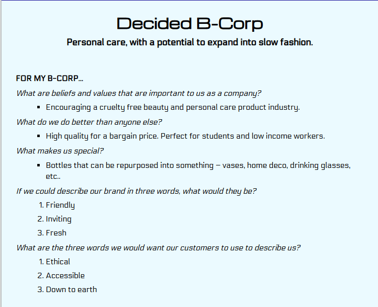
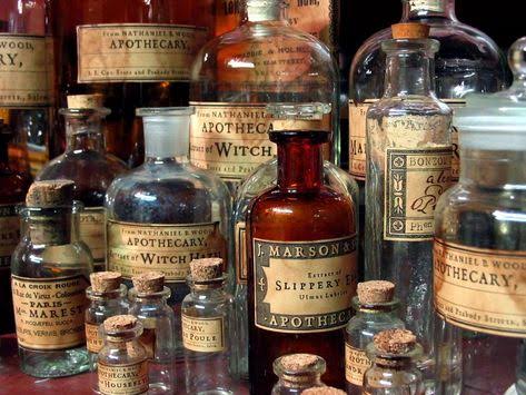
We had to create a brand based on the ethos of B Corporation for this unit, and were given 5 different categories that we could base our company on. I chose to go with a personal care product company, as “personal care” is a very broad concept; it can be makeup, skin care, hair products, toiletries, toothbrushes, toilet paper, etc.
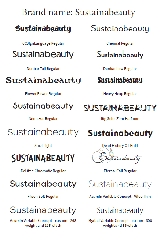
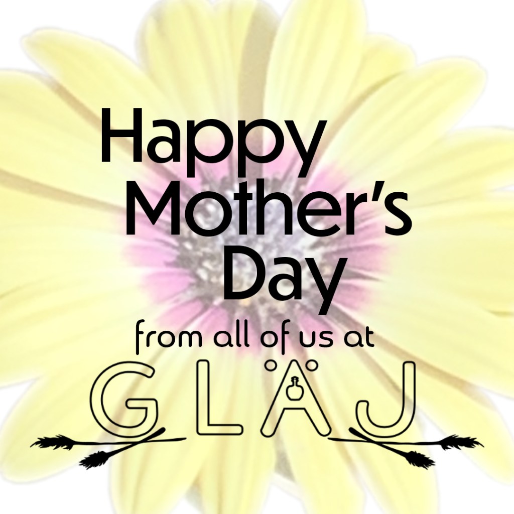
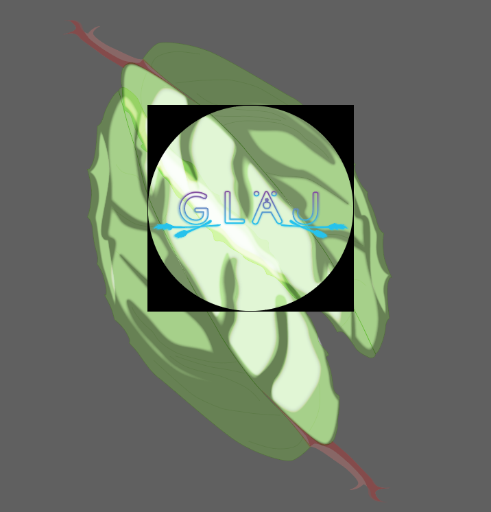
It took a few weeks for me to fully develop the concept for my brand. It also took a bit of trial and error in creating a name for the brand, with original concept names like “Sustainabeauty” proving too much of a mouthful for what I was after. Eventually, the name Gläj was born.
Brand story
Who we are:
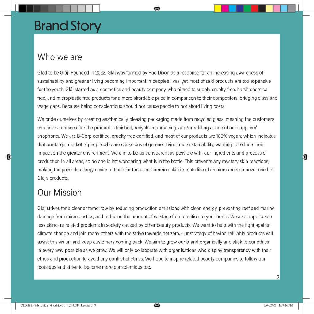
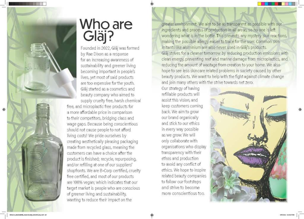
Glad to be Gläj! Founded in 2022, Gläj was formed by Rae Dixon as a response for an increasing awareness of sustainability and greener living becoming important in people’s lives, yet most of said products are too expensive for the youth. Gläj started as a cosmetics and beauty company who aimed to supply cruelty free, harsh chemical free, and microplastic free products for a more affordable price in comparison to their competitors, bridging class and wage gaps. Because being conscientious should not cause people to not afford living costs!
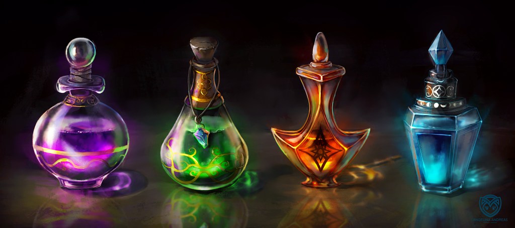
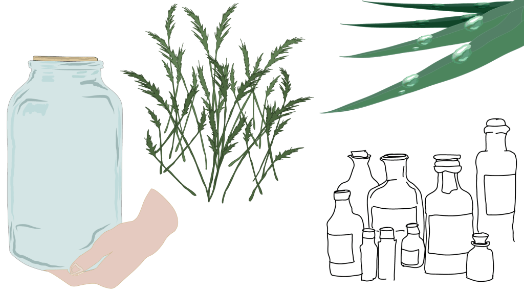
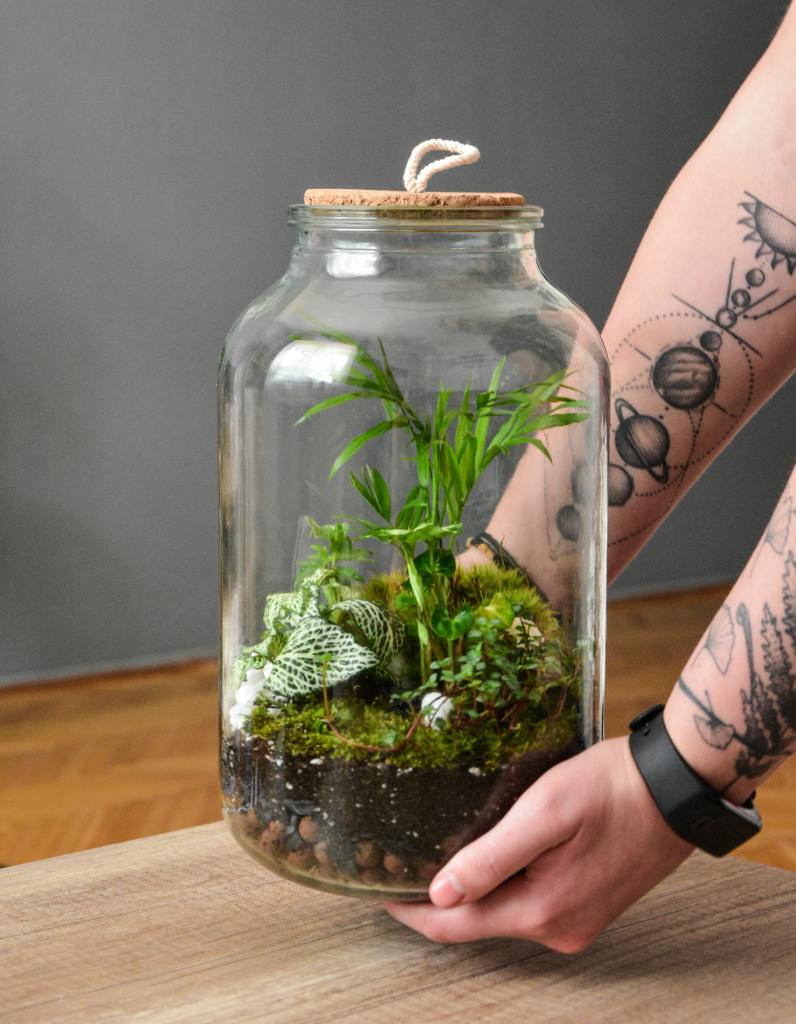
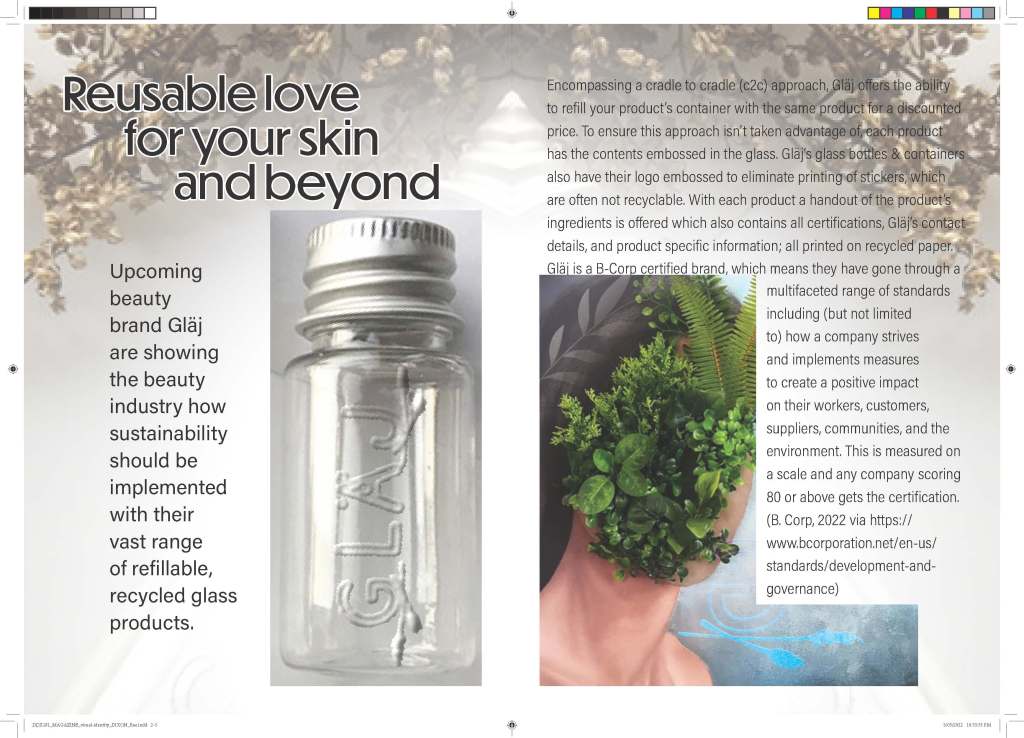
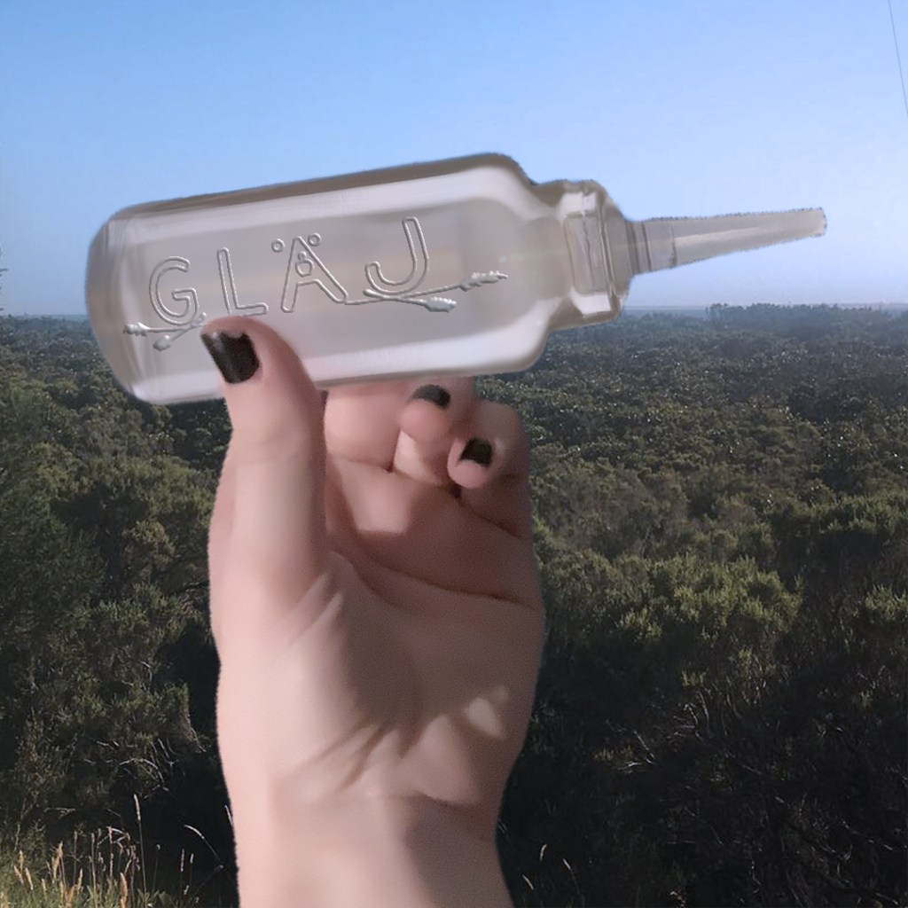
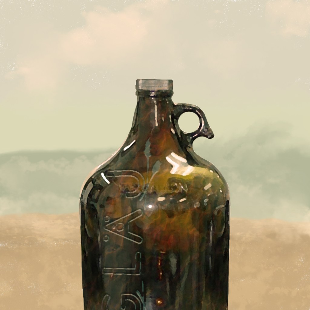
We pride ourselves by creating aesthetically pleasing packaging made from recycled glass, meaning the customers can have a choice after the product is finished; recycle, repurposing, and/or refilling at one of our suppliers’ shopfronts. We are B-Corp certified, cruelty free certified, and most of our products are 100% vegan; which indicates that our target market is people who are conscious of greener living and sustainability, wanting to reduce their impact on the greater environment. We aim to be as transparent as possible with our ingredients and process of production in all areas, so no one is left wondering what is in the bottle. This prevents any mystery skin reactions, making the possible allergy easier to trace for the user. Common skin irritants like aluminium are also never used in Gläj’s products.
Our mission:
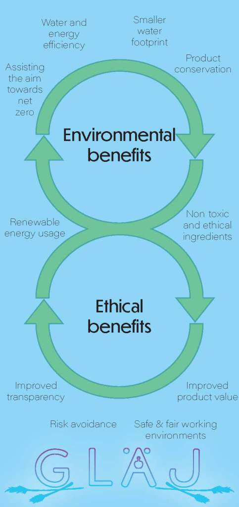
Gläj strives for a cleaner tomorrow by reducing production emissions with clean energy, preventing reef and marine damage from microplastics, and reducing the amount of wastage from creation to your home. We also hope to see less skincare related problems in society caused by other beauty products. We want to help with the fight against climate change and join many others with the strive towards net zero. Our strategy of having refillable products will assist this vision, and keep customers coming back. We aim to grow our brand organically and stick to our ethics in every way possible as we grow. We will only collaborate with organisations who display transparency with their ethos and production to avoid any conflict of ethics. We hope to inspire related beauty companies to follow our footsteps and strive to become more conscientious too.
About the products:
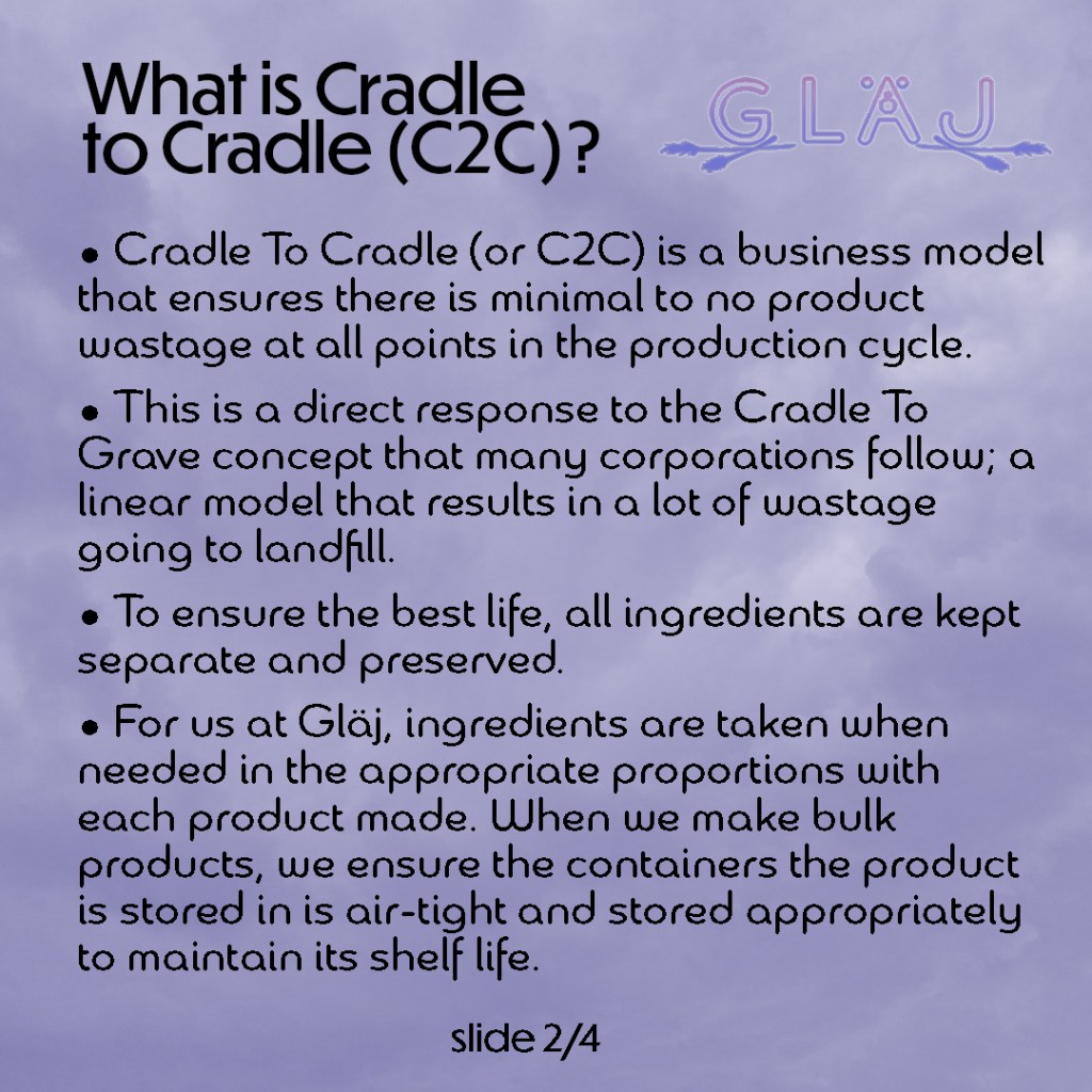
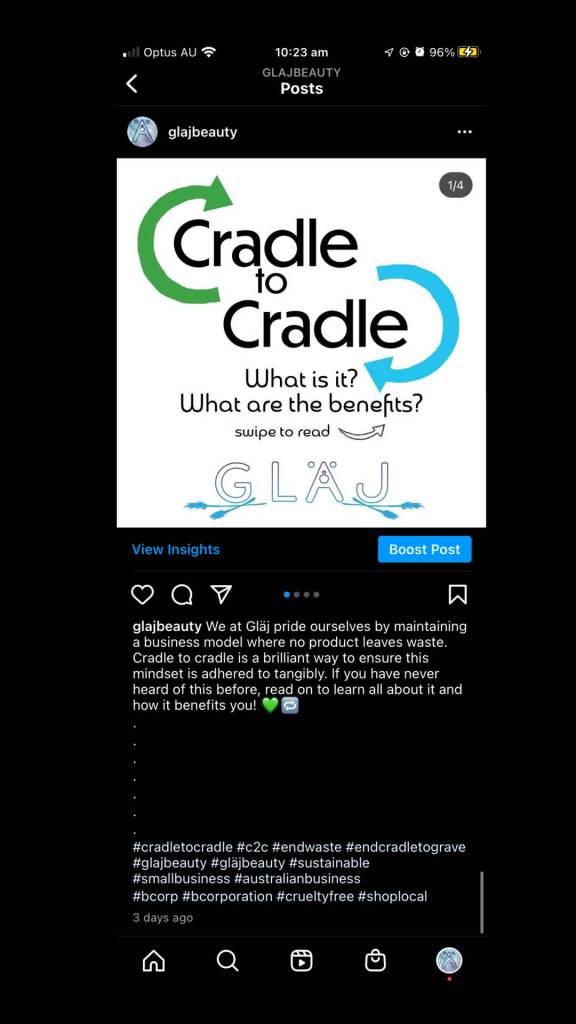
Encompassing a cradle to cradle (c2c) approach, we offer the ability to refill your product’s container with the same product for a discounted price. To ensure this approach isn’t taken advantage of, each product will have the contents embossed in the glass. Our glass bottles & containers also have our logo embossed to eliminate printing of stickers, which are often not recyclable. With each product we offer a handout of the product’s ingredients, all certifications, our contact details, and product specific information; all printed on recycled paper.
Market research
I analysed a few related companies and the reviews of one of them on Google Maps to gain an insight into my target audience for this project; the young and young at heart. These people might not necessarily have the income for most sustainable products, so Gläj is out to change that.
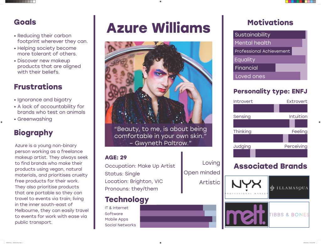
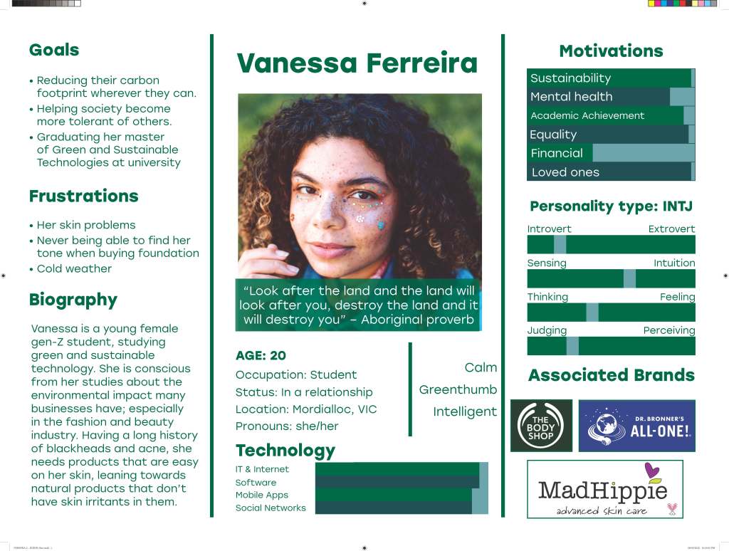
Personas
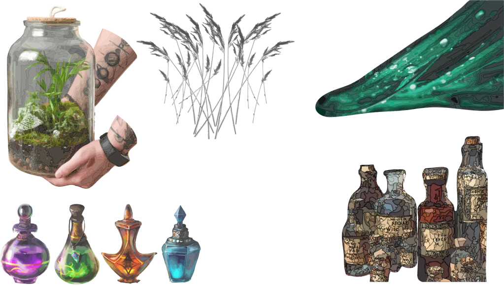
Moodboard and reference images


First visualisations
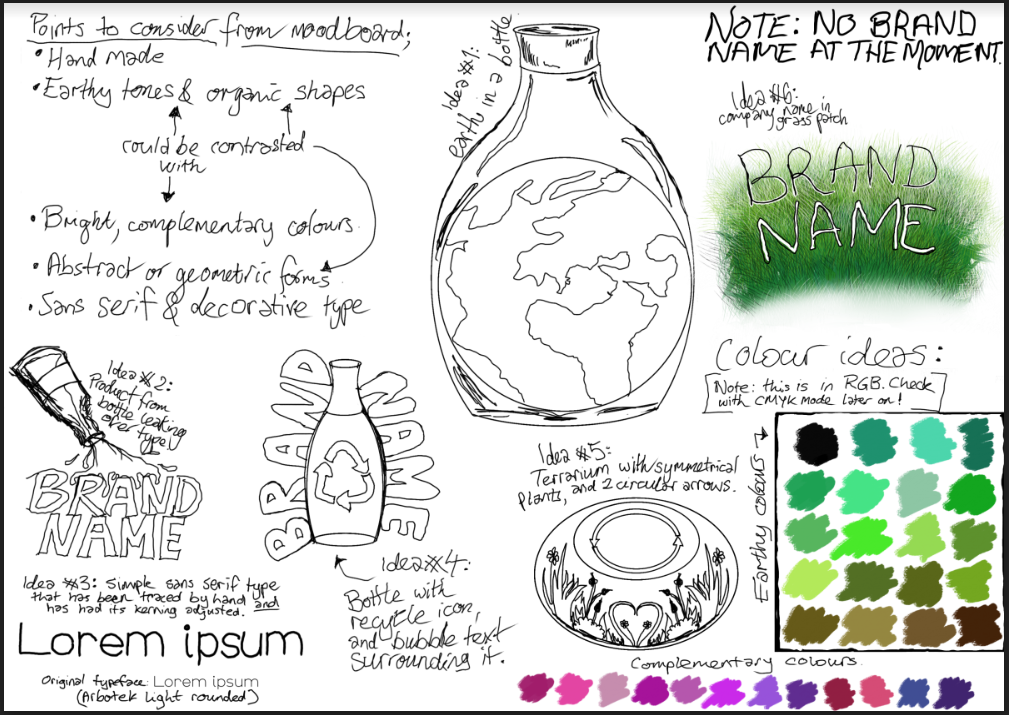
Original name idea with typeface trials
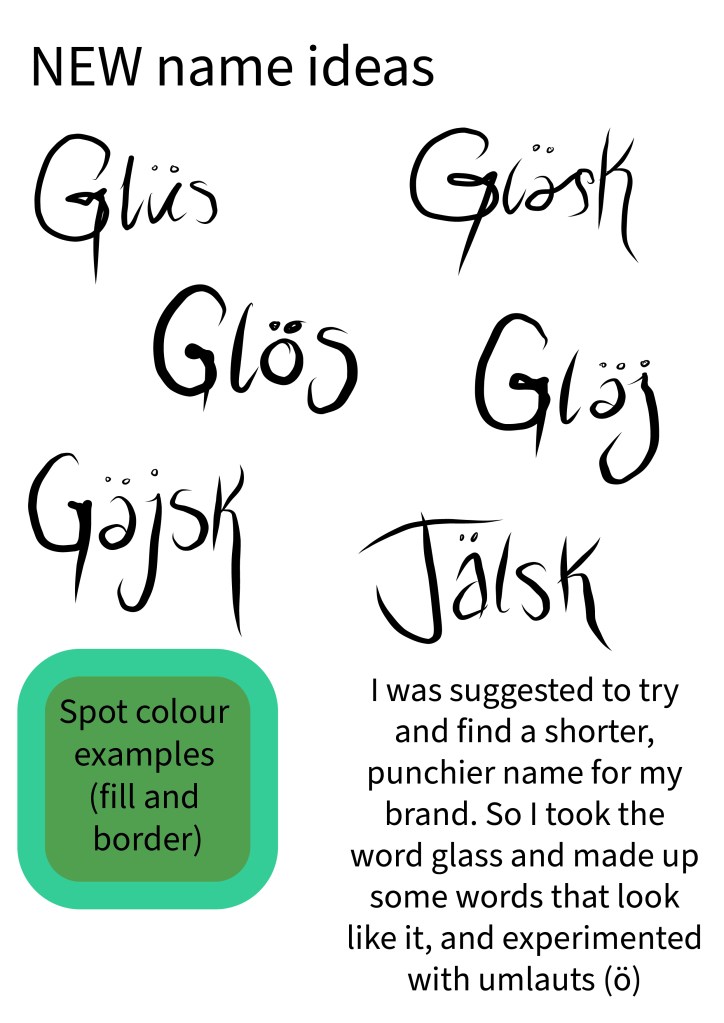
And how I changed the name (plus a spot colour trial, for some reason)
Logo Iterations
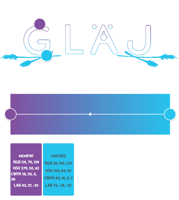
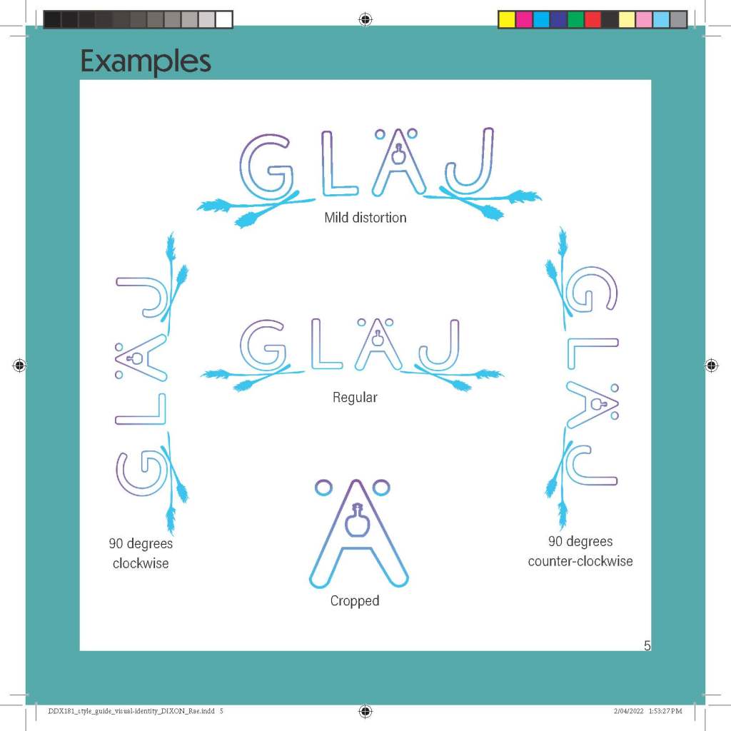
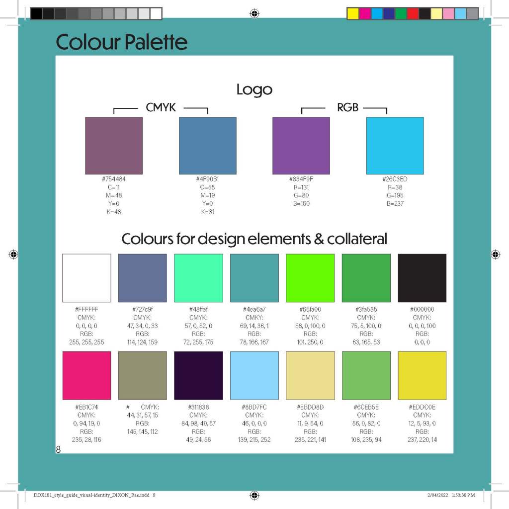
Final logo design and colours used
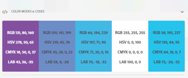
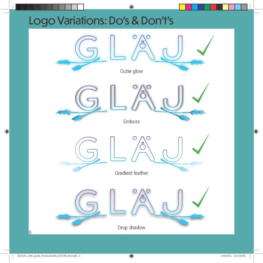
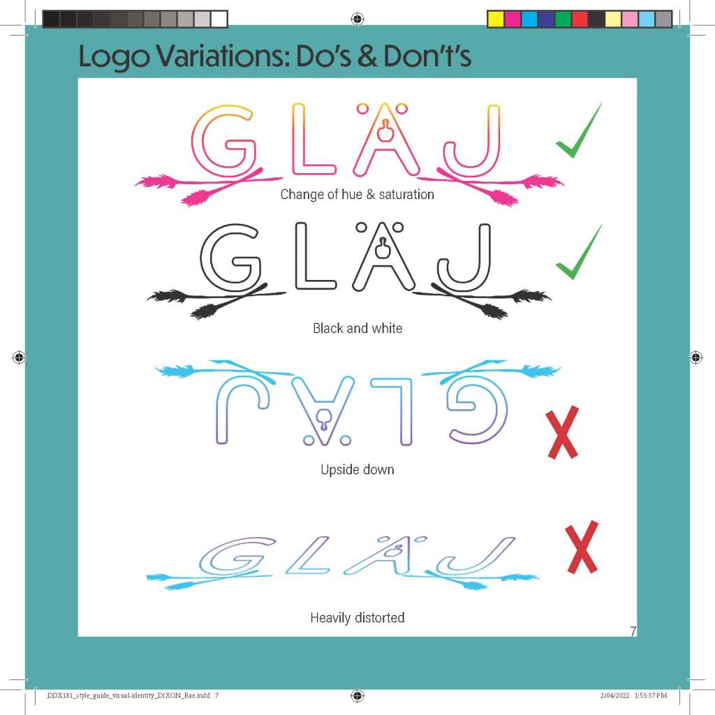
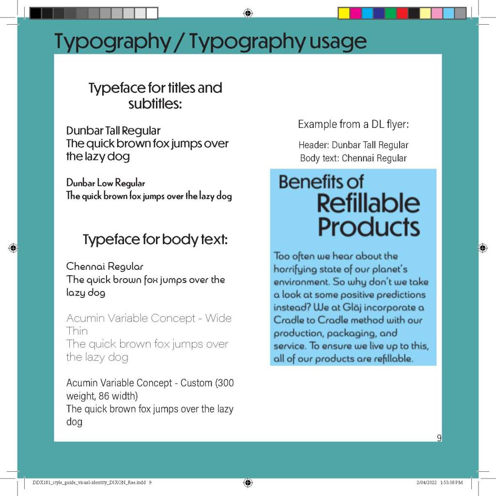
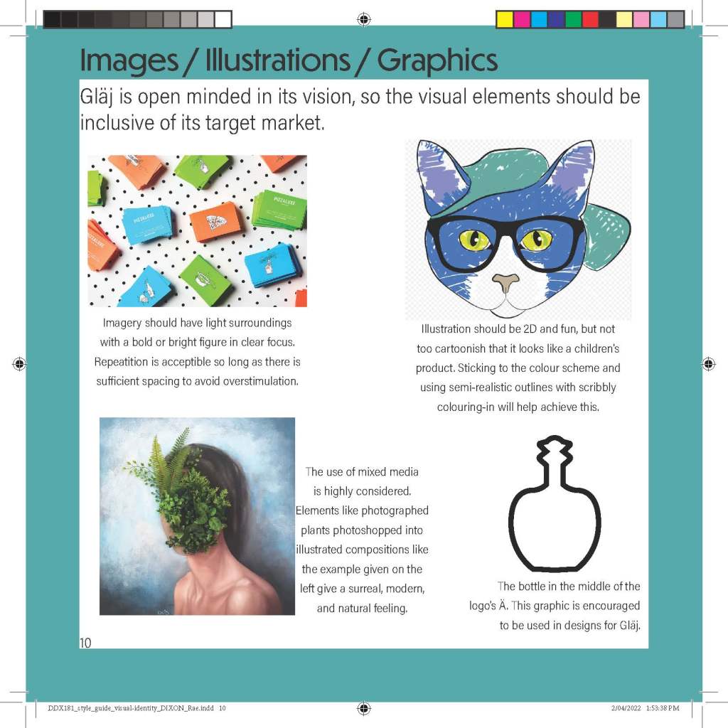
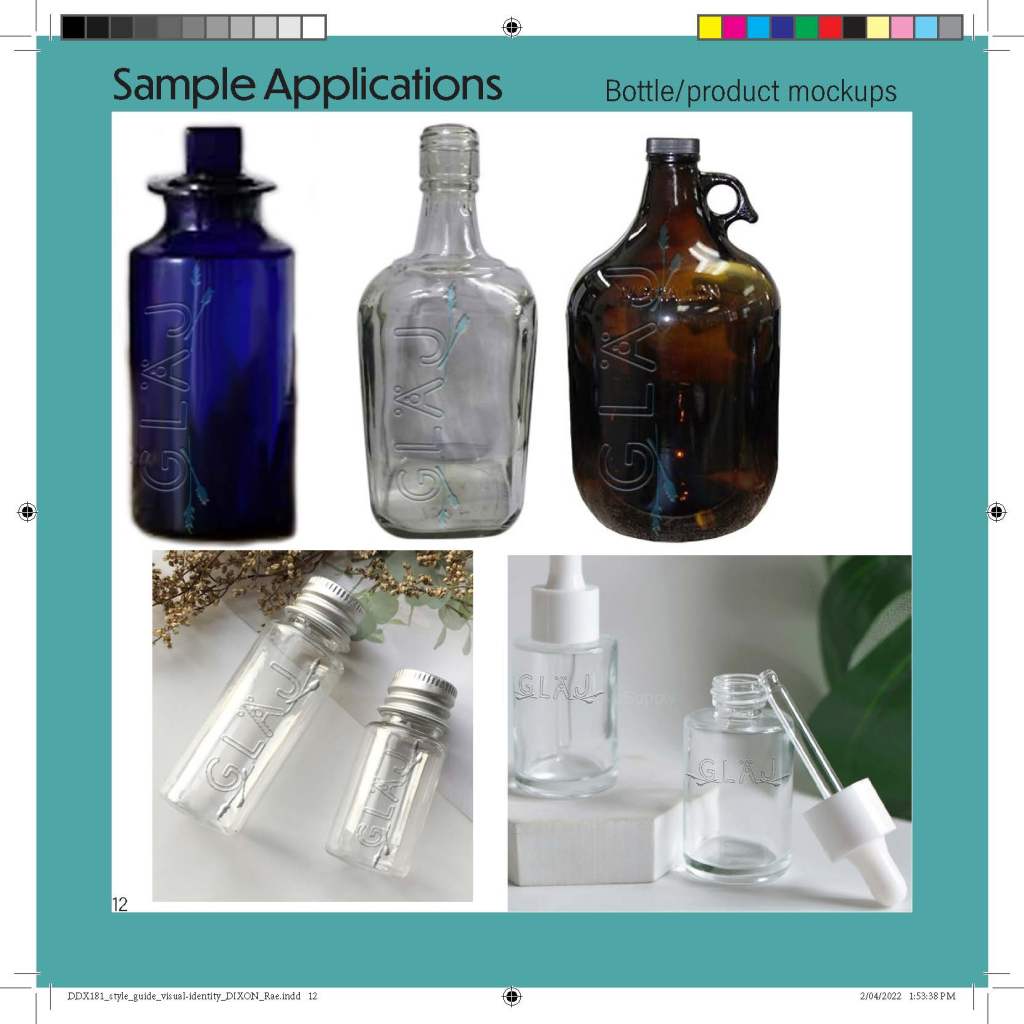
Style Guide


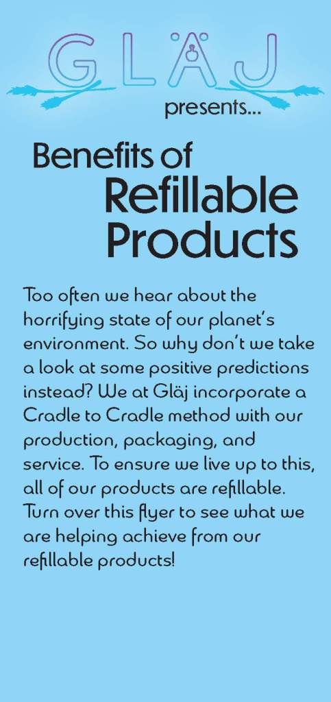
Magazine article and accompanying DL flyer
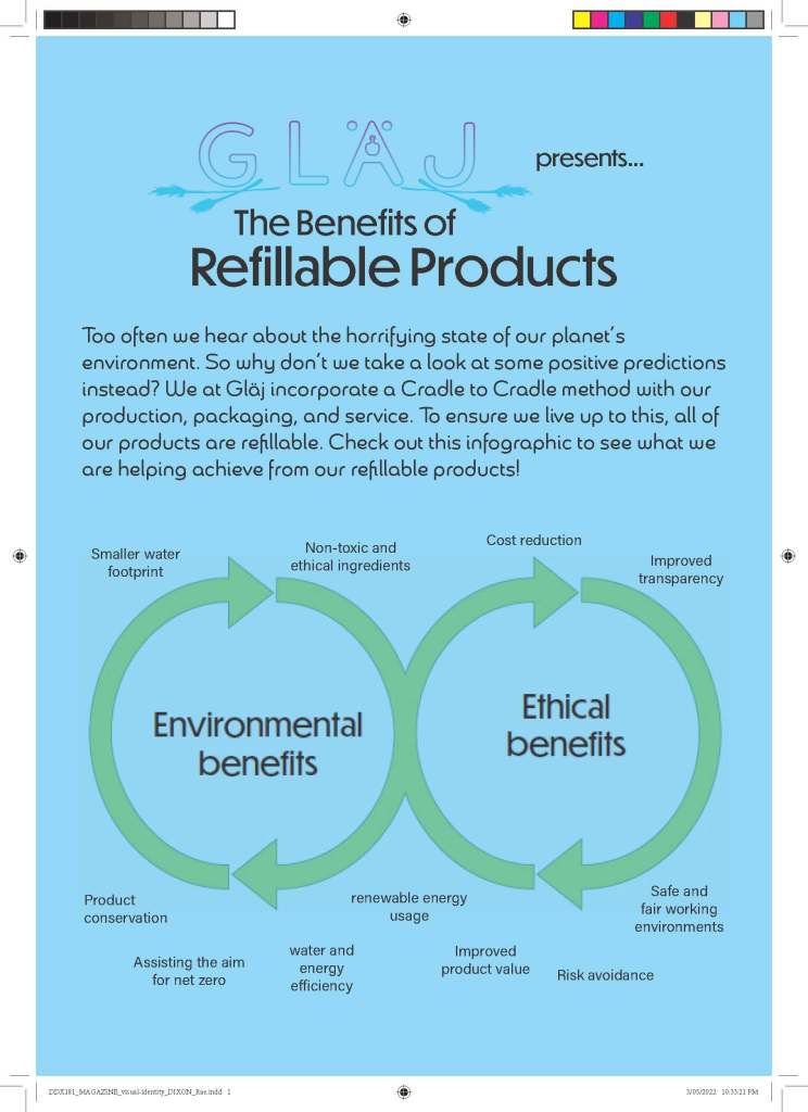
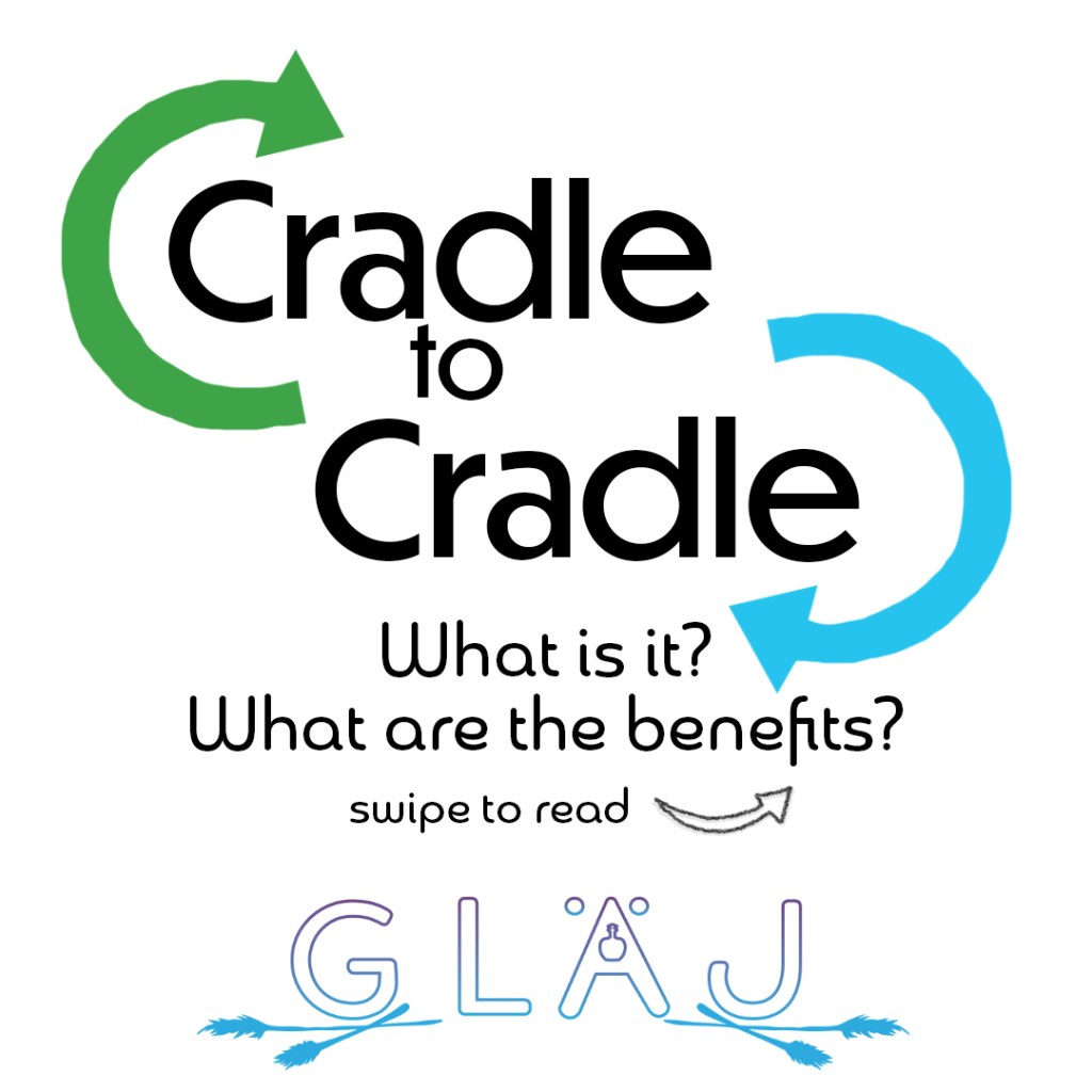
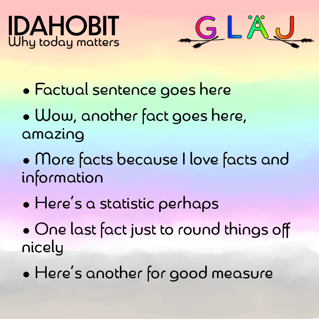
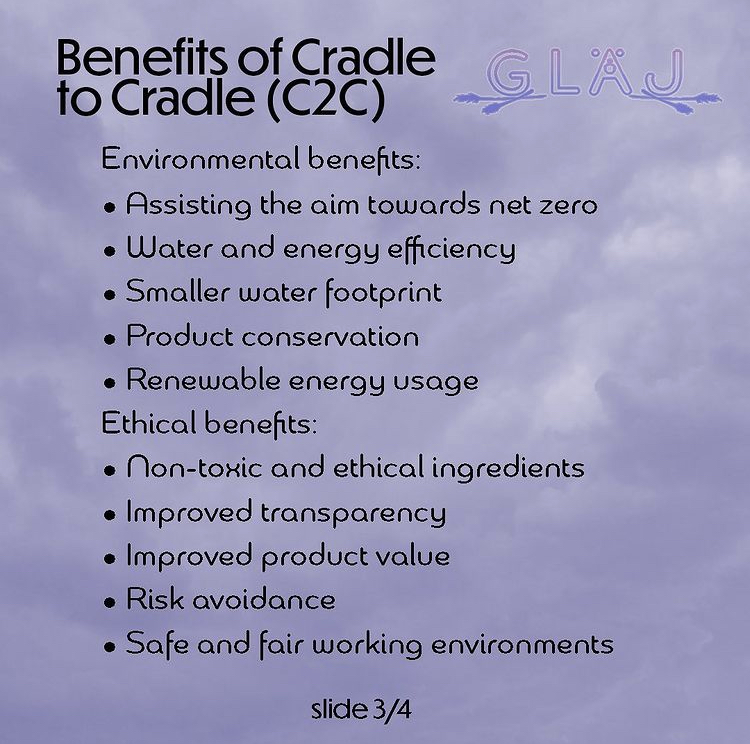
The objective of the flyer was to inform the general public of a cause relevant to the brand; I chose to do Cradle 2 Cradle as it was the business model Gläj planned on going by.
Project 2
This project was based around social media, creating a posting plan and content for my brand to post online.
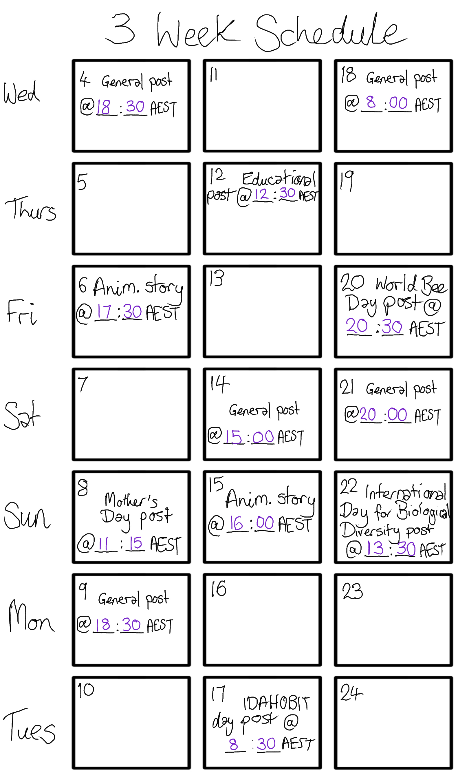
3 Week Posting Plan
Here is the 3 week posting plan for the month of May, 2022. This took some trial and error to get right and decide upon, and took some research on special events to get each date and its content right. Each day of observance listed has some relevance to the branding, more on that will come within this post.
Thumbnail sketches
These were completed according to the first posting plan, and I only ended up choosing 9 posts to go with for this project, but I believe it’s still important to include this to show where I was going!

Posting plan with copy

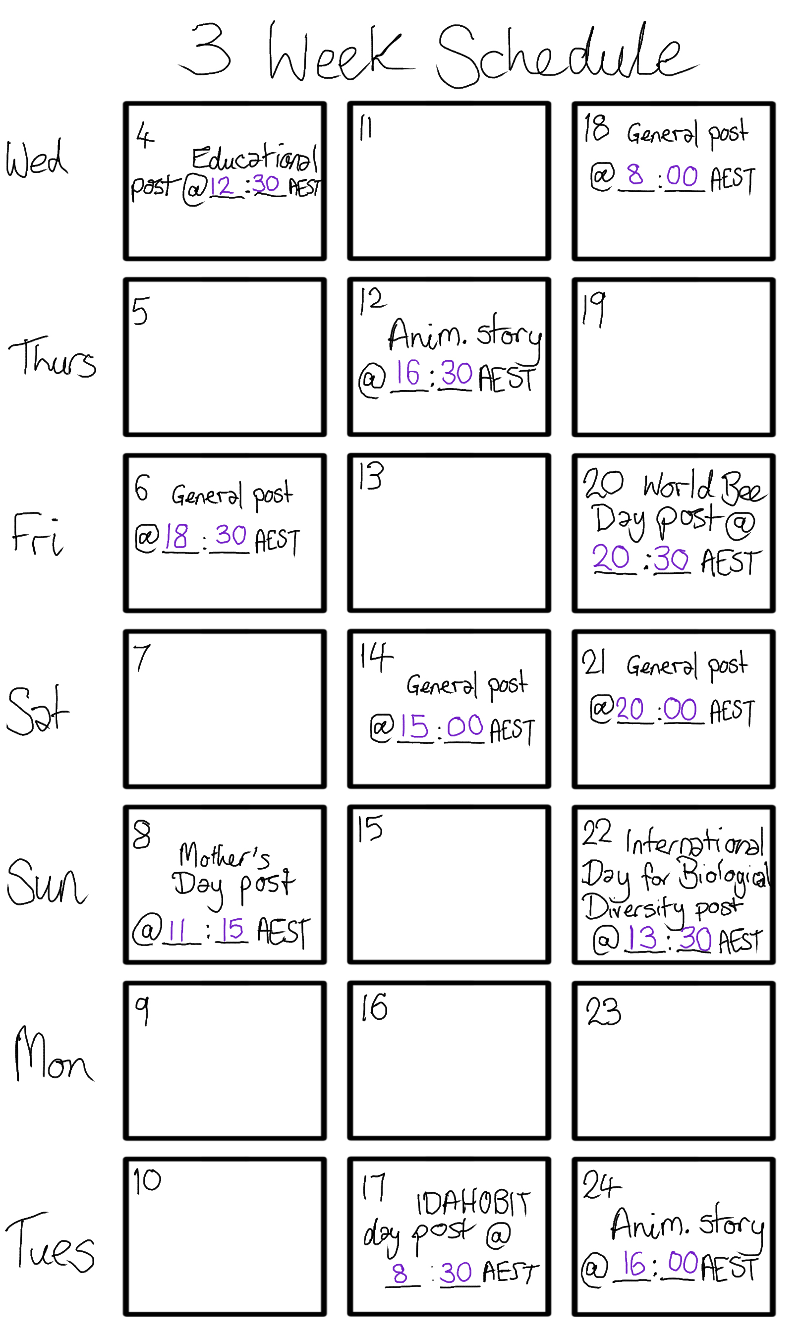
Refined posts
These are finalised prototypes that did take iterating to get right. The first grid of 9 shows the posts before refinement, as does the previous image with the posting plan. Side note: 4 of these posts are image carousels, those will be featured further down this page.


Animated stories

Creating a profile picture
I used that same vector leaf from the After Effects story to create a background for Gläj’s profile picture. I changed the blending mode to overlay and sent it to the back. Once I scaled it highly, I duplicated the leaf, flipped it (both horizontally and vertically), and placed it next to one another with a slight overlap. The overlay fill gave the leaves a glass-esque effect to it. Sadly despite how amazing this looked up close, it lost detail when scaled down. So I will need to revisit this and trial another idea, or make adjustments until it looks good at a small scale.
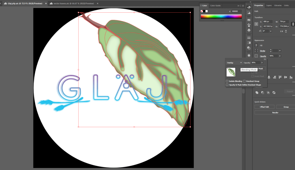
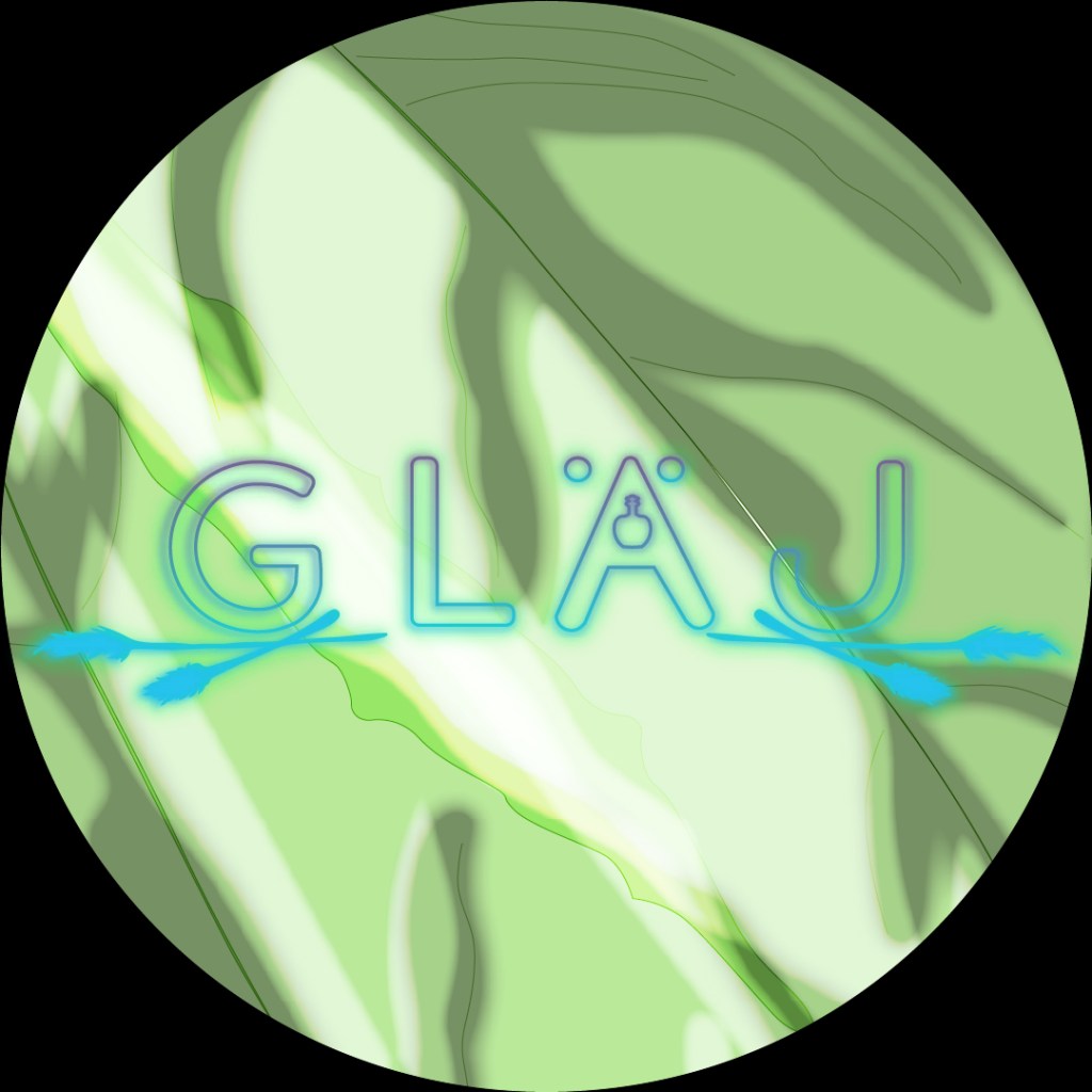
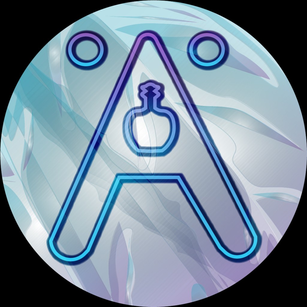
…and now we have a better end result. What I did to get here? Just by using the stylised Ä, there is a lot less stimuli to view at a small scale. I added a graphic effect to the leaves in the background called “RGB Glass” under the textures library. This not only gives a glass effect – fitting as the majority of the products are in glass bottles – but it also has the same colour scheme as the logo itself. For the Ä, I duplicated it so there were two layers. The bottom layer I increased the stroke size to 40 pt, changed the opacity type to colour burn, and added a feather of 6 px. I nudged it a few increments south east so it looked like a more realistic shadow. The top layer I made the same proportional line shape (at the scale I was at it was 12 pt), then added the opacity type to screen. That lightened and saturated the existing colours so it really popped
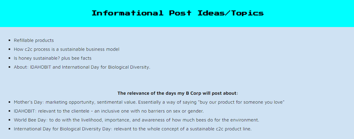
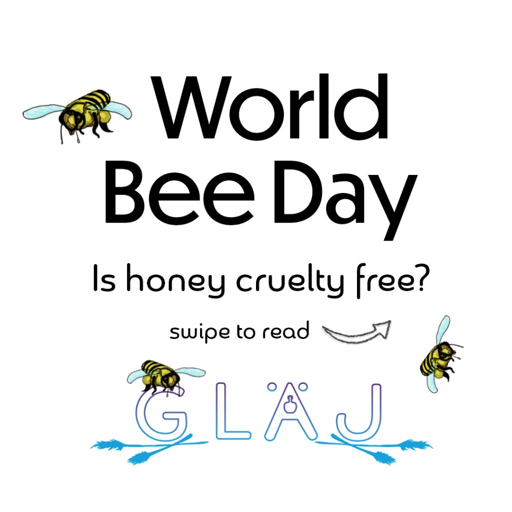
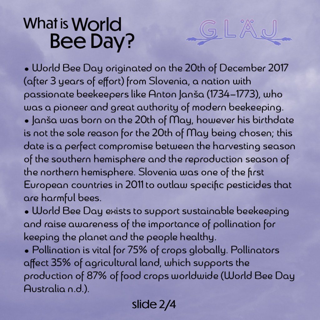
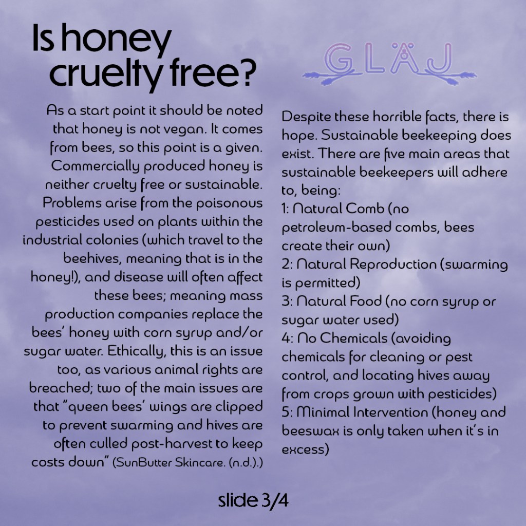
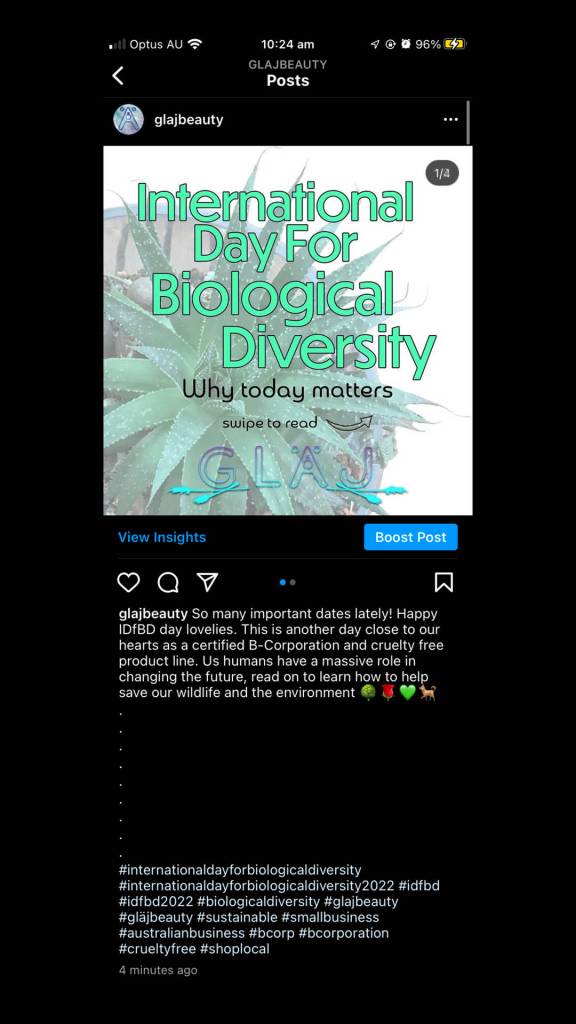
Image carousels – informative slides
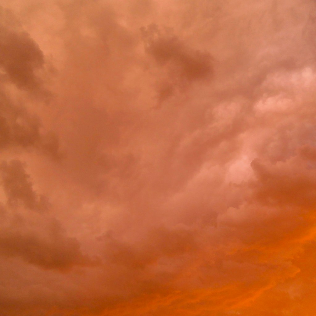
I have the idea of literally just using the backgrounds that were used in the first slide. I made the opacity 25% down from 47% in the first trial. This plan did fall short however, as both the Cradle 2 Cradle and World Bee Day posts have a plain white background, so I tried a different approach. I used an old photo of mine that I took of the sky, adjusted the colours and opacity, and moved the body text around on the page for it to look better. I used a grid of guide lines to get everything aligned well. Below this text box is an image carousel of the settings and original cloud image used to create this backdrop. If I had kept the photo as it is, it would have been way too overpowering as the text and logo would’ve been lost among the details.


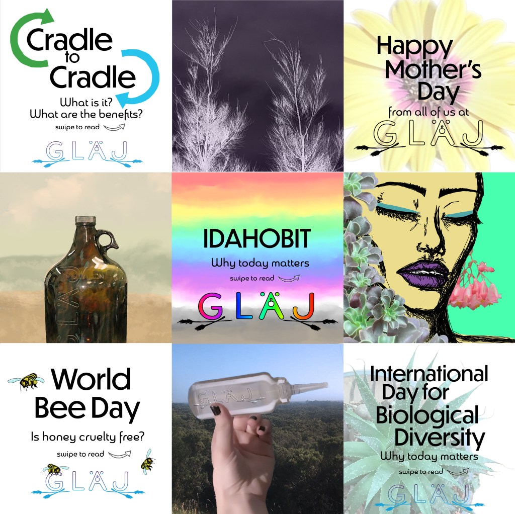
Carousels (selected ones)

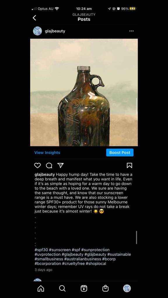
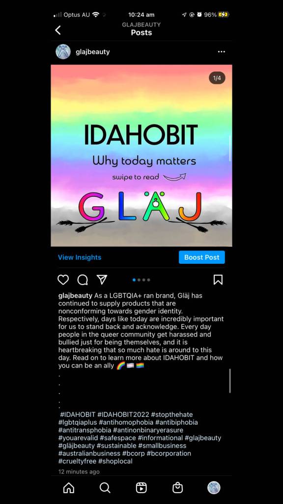
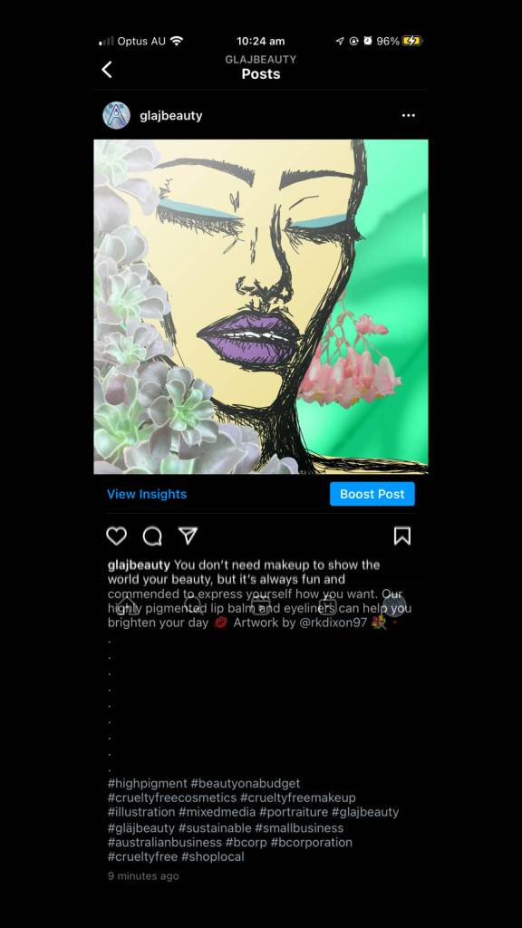
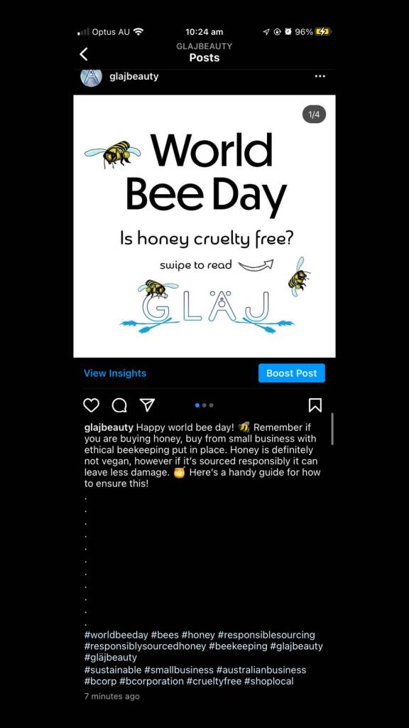
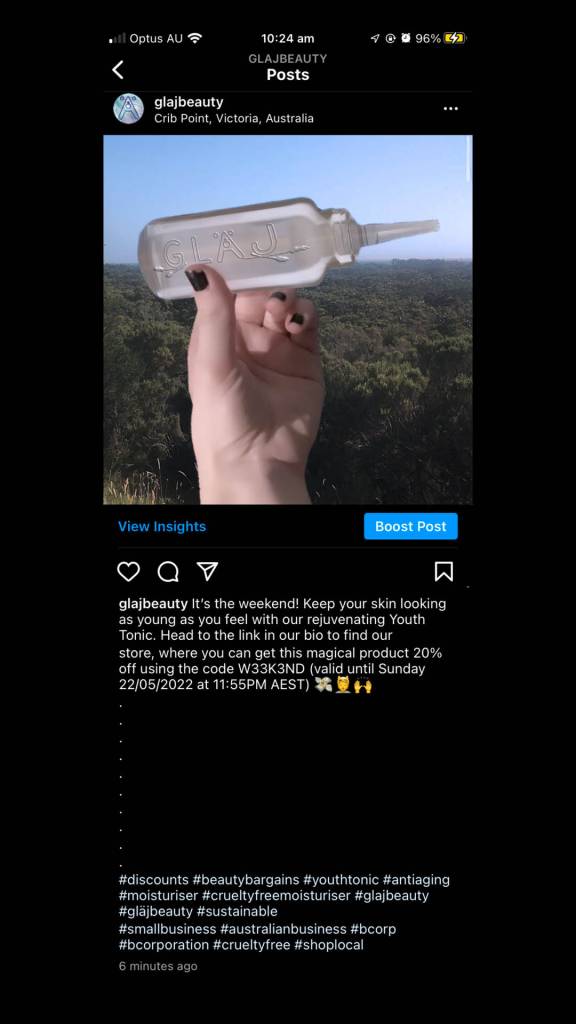
Final uploads
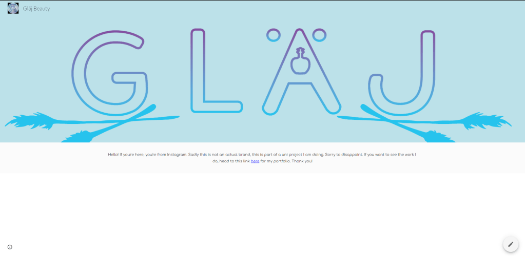
I created an Instagram for this project, I have deleted it however as I didn’t want to mislead people. Here are the screenshots of them and the text. The link on the Instagram account led to a plain Google Site explaining that it’s not a real organisation (as pictured) which offered a link to my Adobe Portfolio.
Reflection
Firstly, I’ll post my reflection in 2022 (when I did this), and then I’ll post a reflection from now (2025)
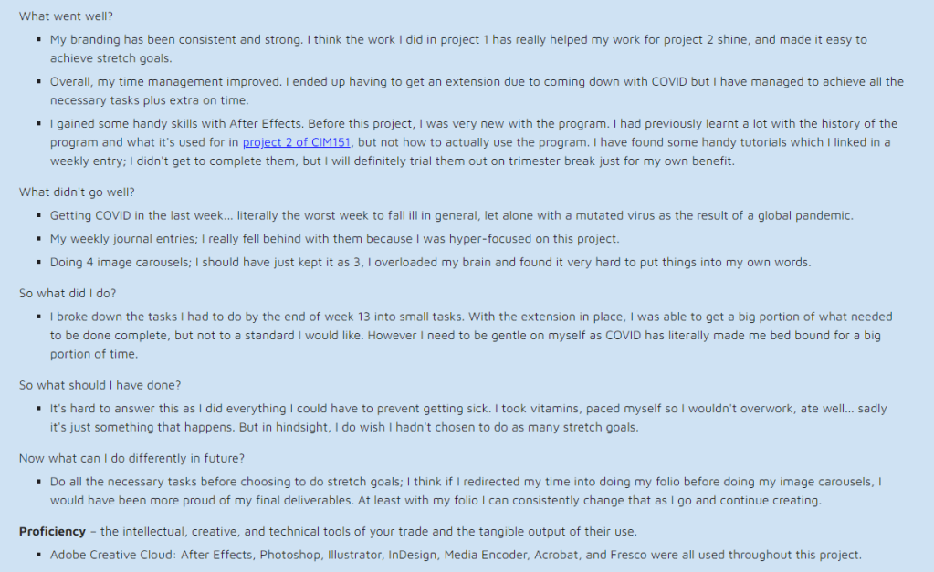
Upon re-reading this and re-uploading this to this site as opposed to Adobe, I still follow a lot of the sentiments I had. In saying that, I’m proud of the process of this project and the improvement of hard and soft skills I acquired during this trimester. This was the last unit of the diploma, and I had applied to continue onwards with a bachelor’s degree… which is something I never thought I’d be capable of!
