
text
Trimester 1 – DDX170
Project 1: Creating patterns using a motif
(rationale written in 2021)
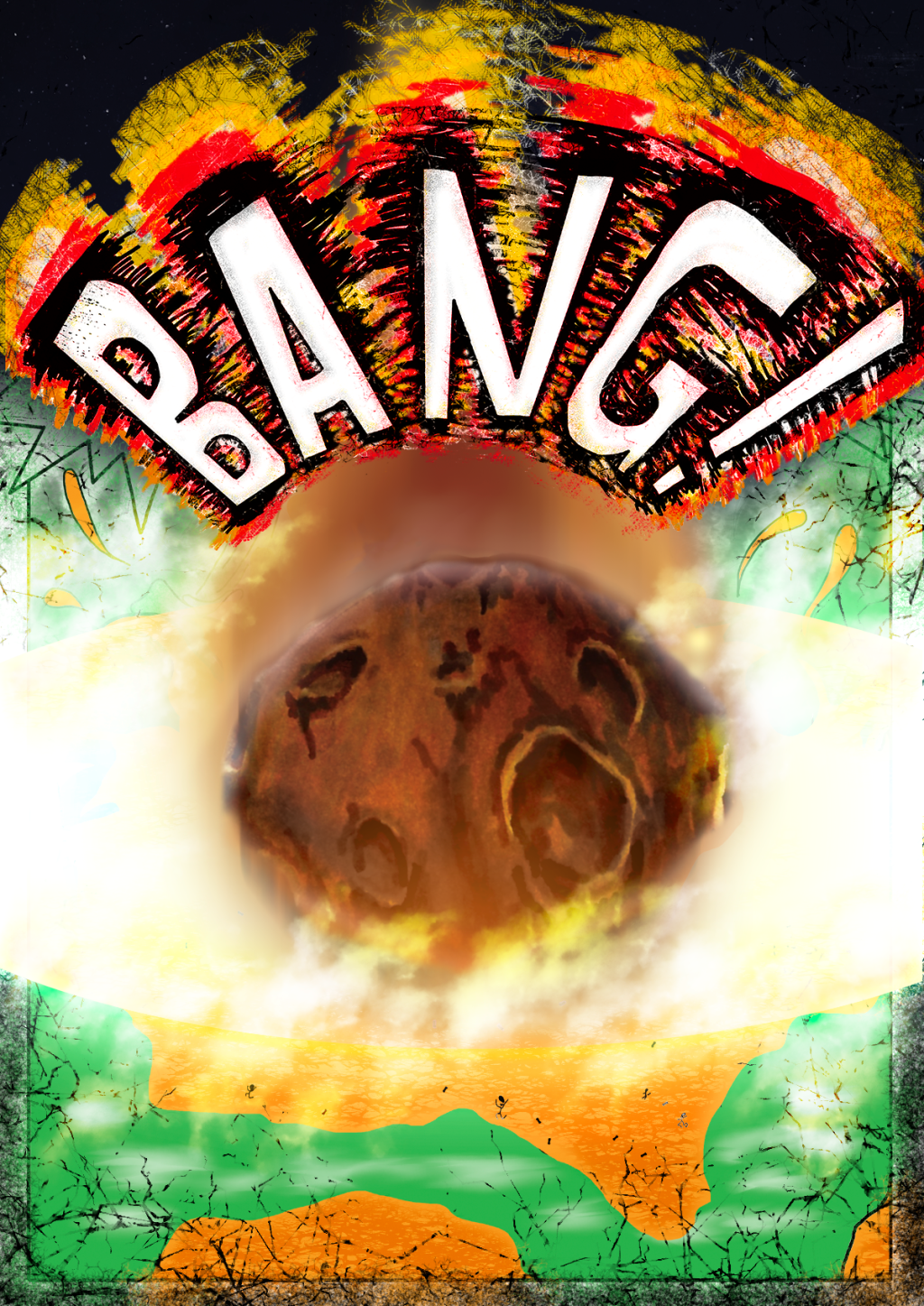
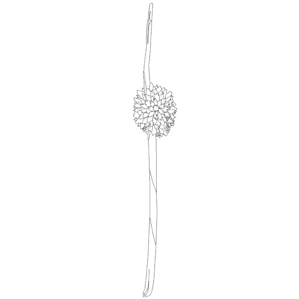
My motif was influenced by the geometric shapes used in Art Deco and in A.M. Cassandre’s art and design, as with the colour scheme and how I arranged each pattern deliverable. Cassandre, although her explored a variety of styles other than just art deco, inspired my use of choosing a plant that looked like it had a COVID particle on the end… making a statement about the state of the world we live in right now, portraying the emotions associated with seeing the particle but in an unsuspecting way due to the proportion of the plant’s spikelets and the microscopic size of a COVID particle. This is a stretch I realise, but when I first saw the plant, my mind just went “COVID plant”.
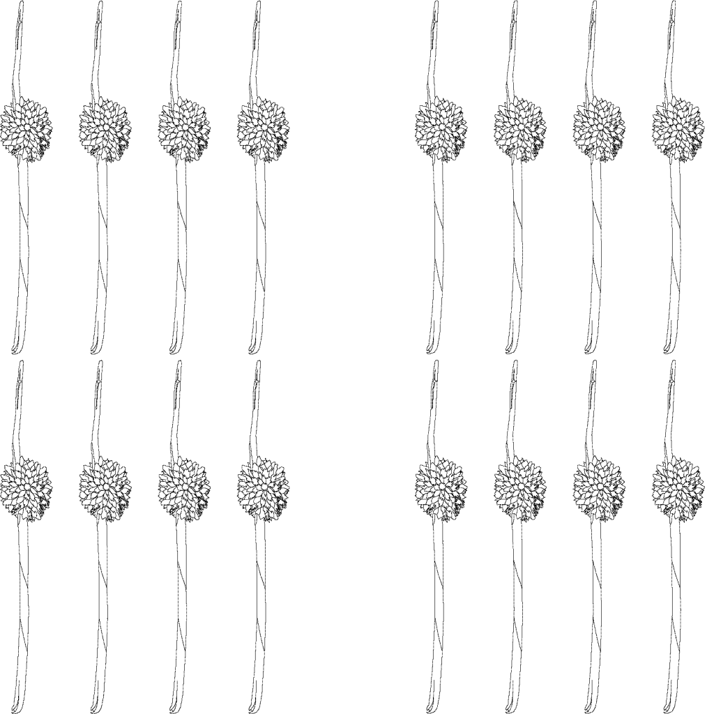
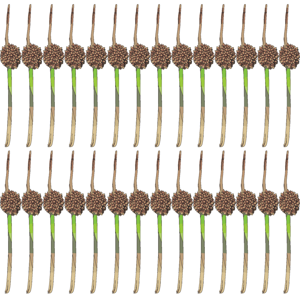
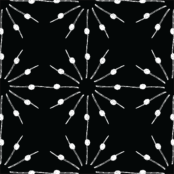
I drew a variety of plant cuttings as I wasn’t quite sure what design period to look into at first, however I ended up choosing a cutting of a plant called Scirpus atrovirens, also known as dark-green bulrush. The geometric shapes that are focused on in Art Deco is heavily reflected in the Dark Green Bulrush’s formation. The plant has straight shooting stems, and the spikelets are formed towards the ends in a circular/spherical shape. This made the choice of choosing Art Deco a very simple one! The plant itself had contrasting organic and geometric shapes despite it being an organic object itself.
The deliverables all had repetition as a key principle, as it was the exact same motif repeated with different colours, or in a repeating pattern. I used location emphasis in the black on white pattern by making a noticeable space in the centre of the file. I used harmony with the white on black pattern by placing them in a radial pattern, while aiming to duplicate the same radial pattern in a way to create a seamless file; this will create a repeating pattern with the same space between each motif if repeated on a larger document. I also used unity by giving a close proximity to each motif on the pattern in colour file, which tied in the pattern to make it seem even more colourful than it would if spaced out more.

Project 2: Pictorial Mark
(rationale written in 2021)
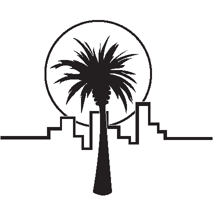
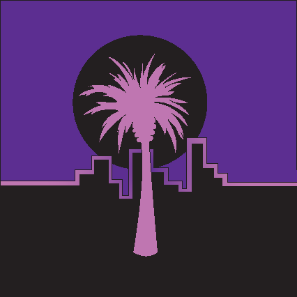
For project 2 of DDX170, I created a pictorial mark for my classmate Déshan. I was influenced by his passion for film, his love for geometric shapes, and the mix of urban with organic subjects he focused on in his portfolio. The juxtaposition of urban and organic themes in his folio reminded me of two commonly-overlapping styles I know a lot about: vaporwave and synthwave.
Both styles are futuristic, yet bring retro elements and vibes to the table. Palm trees were photographed in Deshan’s folio, and palm trees are used often in vaporwave, so it wasn’t hard for me to not make that association. Upon trialling with shapes and geometry, I was influenced by the common symbol in synthwave of a sun or moon with horizontal lines cutting through the circle. I trialled this in my sketches, but I thought it would’ve been a bit too busy with the palm tree leafs. Also I didn’t want to make it purely in this style; I wanted to make it my own, make it something that would appeal to my client, and my client’s future clients.
The idea of turning a city skyscape into a line was honestly a moment of pride for me. It obscured an existing thing into what looks like a random line, but when colour was added it was evident that it was a silhouette of a cityscape. I didn’t plan on this during the creation stage on Illustrator, so overlap occurred on the 2 black & white versions of the pictorial mark.
Contrast was used by combining organic and geometric shapes, random rhythm was used for the cityscape, the sun/moon around the palm tree is using emphasis by creating a focal point for the viewer, and radial balance is achieved from this too.

Project 3: Logo
(rationale written in 2021)
I have designed a logo for my client who is creating a day camp for families of all ages in regional Victoria. The target audience for this day camp are assumedly too busy or have prior commitments to attend to, where a regular overnight camp is out of the question. The day camp also aims to advertise towards educational institutions and day centres, so they can organise excursions for students and clients to attend the day camp!
I chose Cloud Hopper for the name of this company by using word association; the words cloud and hopper put together makes one think of high altitudes and physical activity. Activities like abseiling, high ropes course, and rock climbing are all above the ground; it just so happens that this day camp is going to focus on off-ground activities like those.
I used the name to my advantage while designing as clouds are natural and attractive to the human eye. I decided to go for a simplistic cloud as opposed to a realistic cloud, because it takes less time to register in the human mind. This also helped shape the logo so it could fit in a square space, which is very beneficial for online presence as profile pictures and business posts on websites like Instagram and Facebook have squared ratios. I also made sure the typeface used was very simplistic so it could be readable by children as well as adults and elderly. Using bold italic Century Gothic helped me achieve this readability, and by manipulating the skew of each letter, making the typeface look like my own; as opposed to just a generic font that’s available on most computers.
The proposed logo will be used to give the day camp branding that is exciting and inviting for all walks of life, enticing the target audience to show interest; consequently leading to more people coming to the day camp. The logo is going to be used in: a letterhead to make the camp’s documentation appear more professional; an envelope sticker that can be placed on any envelope or packaging to be sent by mail, bringing variety to their packaging options; and a business card that contains a conscious design decision to partially shape it with the same cloud used in the logo, making it stand out and invoke conversation as it’s not just a standard rectangular business card. These all will help boost the business’ credibility, popularity, and increased clientele.
Trimester 1 – DIM111
Most of this subject was theory-based, so I will keep it as just Project 1, which was to create a stop motion video.
Trimester 2 – DDX171
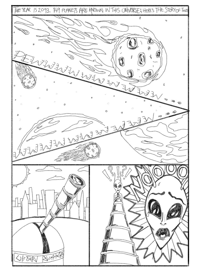
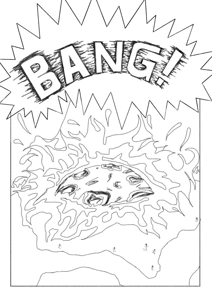
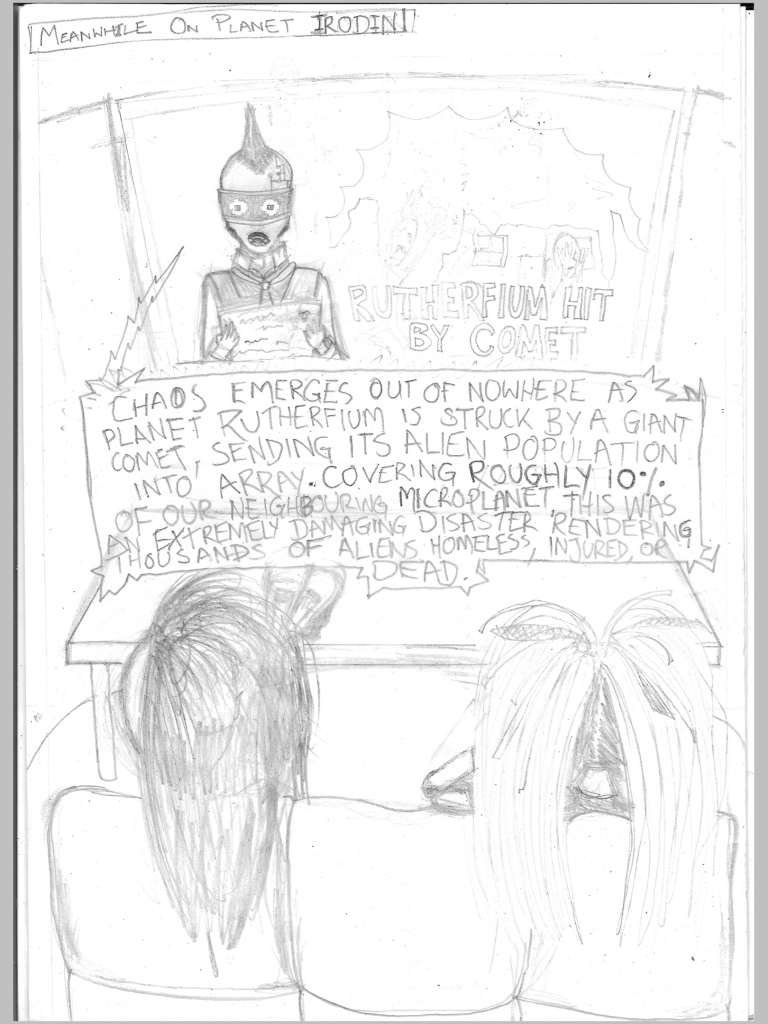
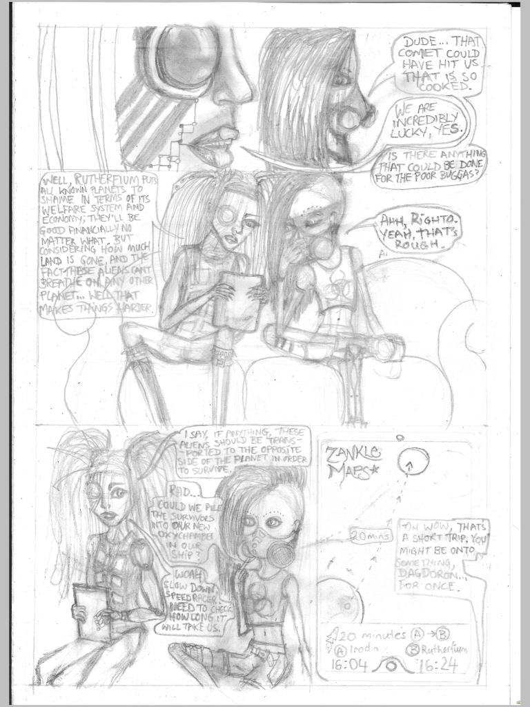
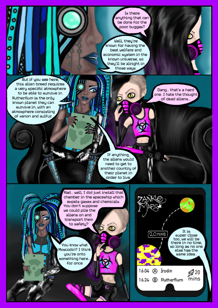
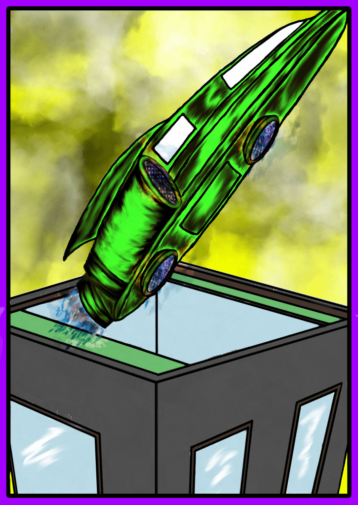
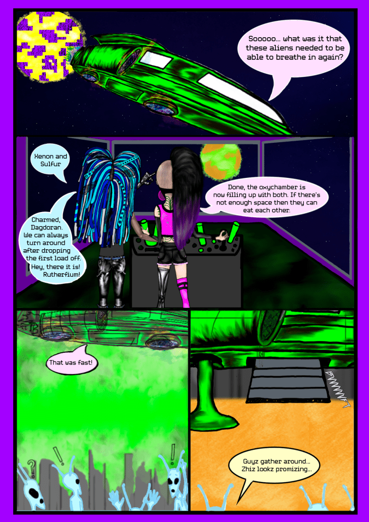
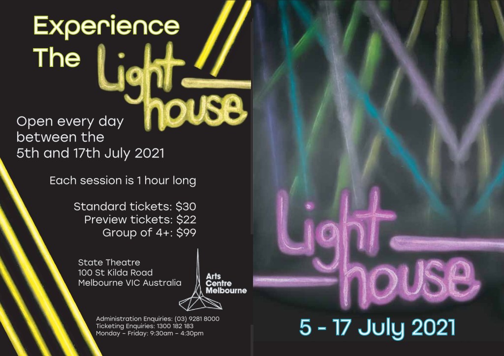
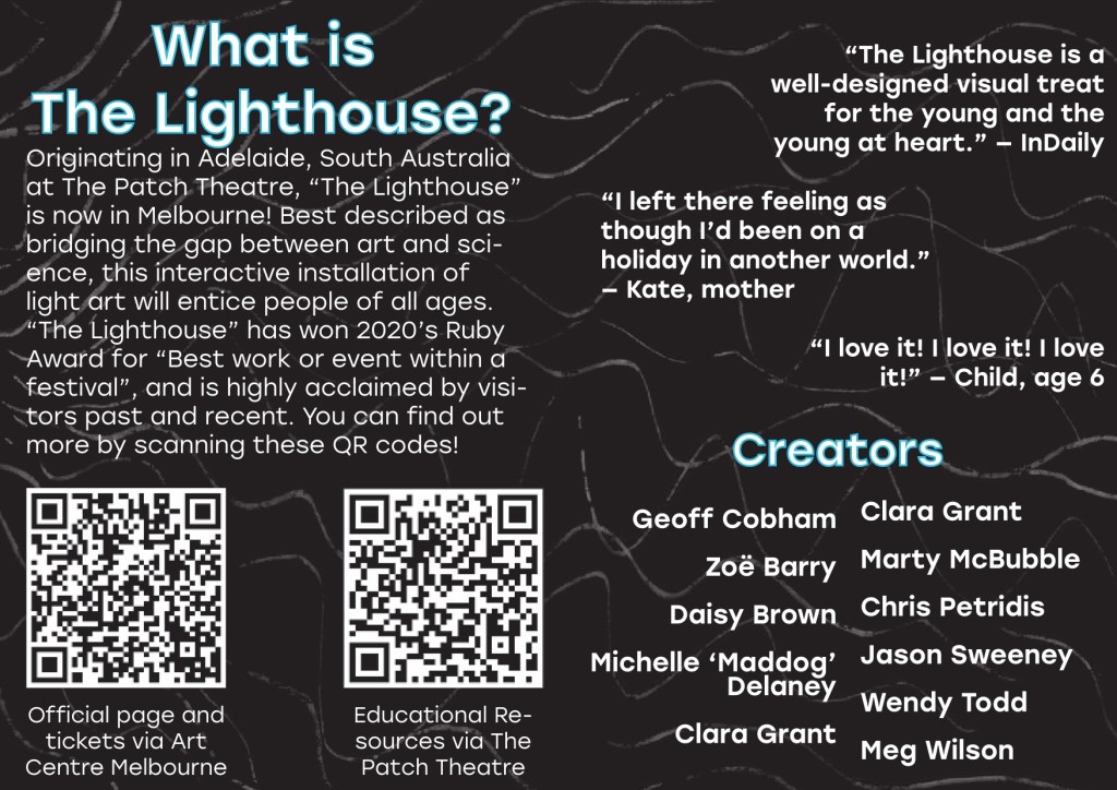
text
text
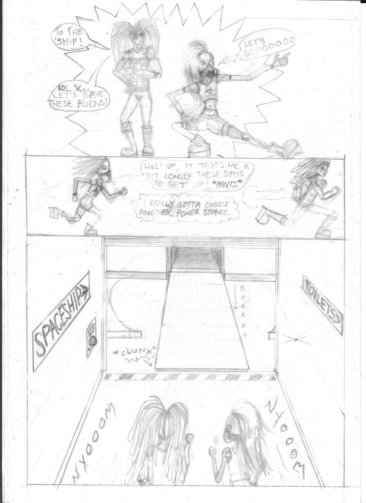
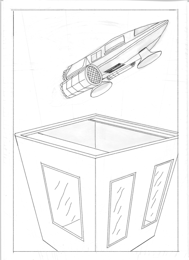
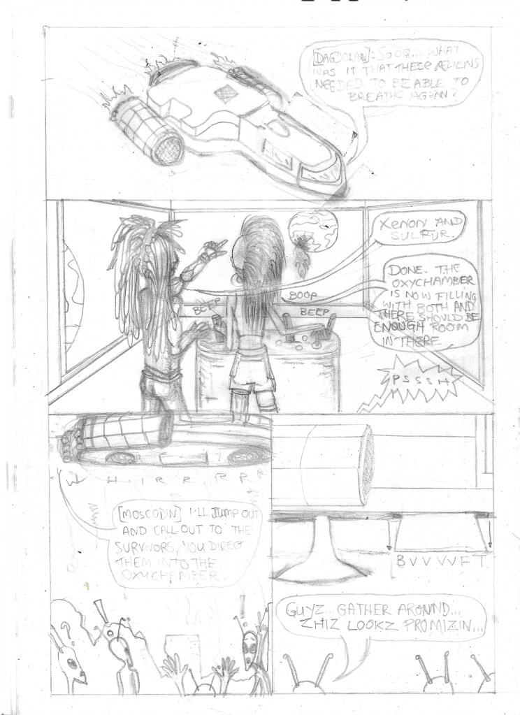
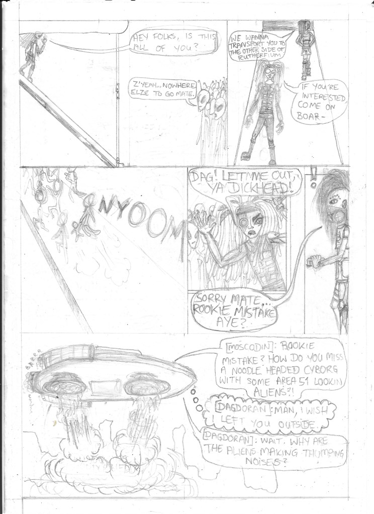
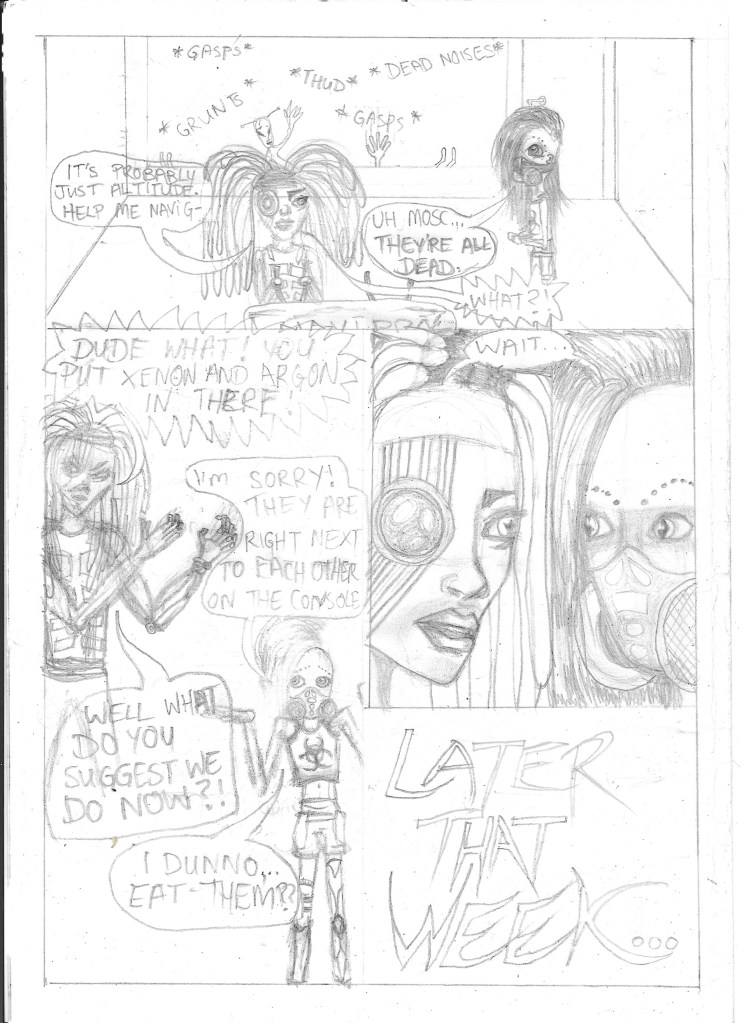
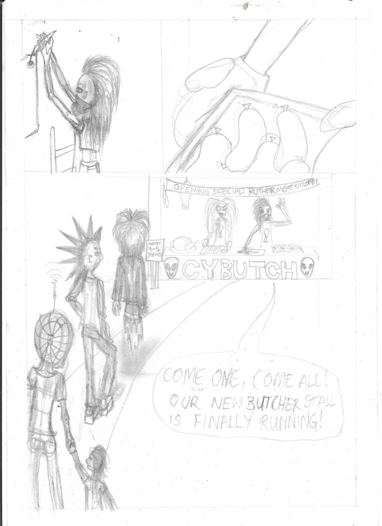
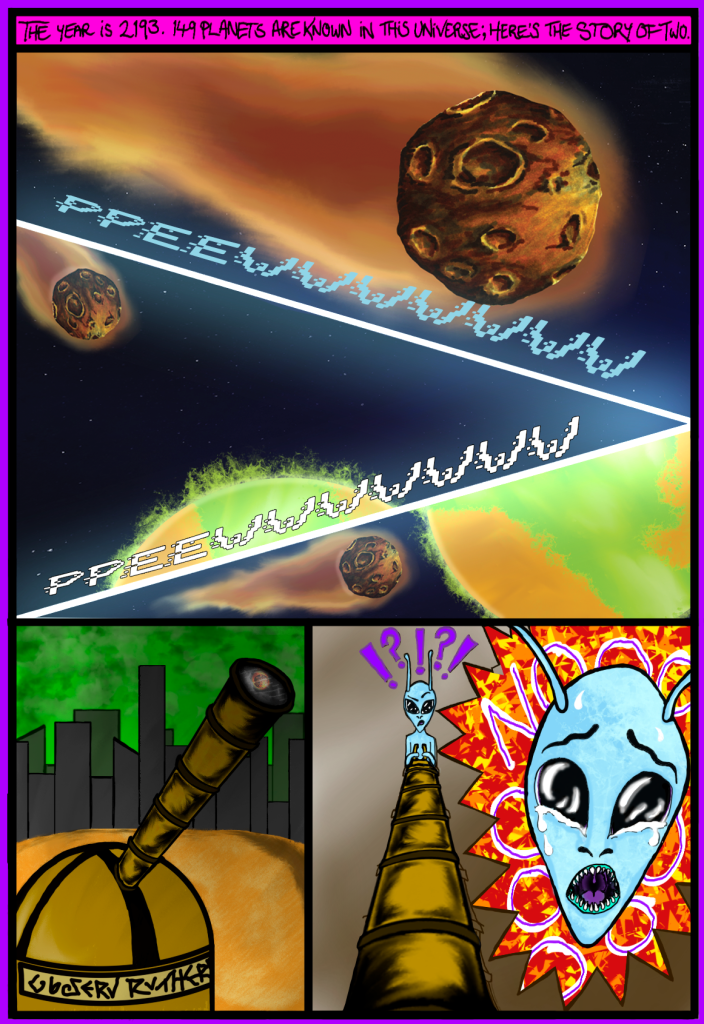
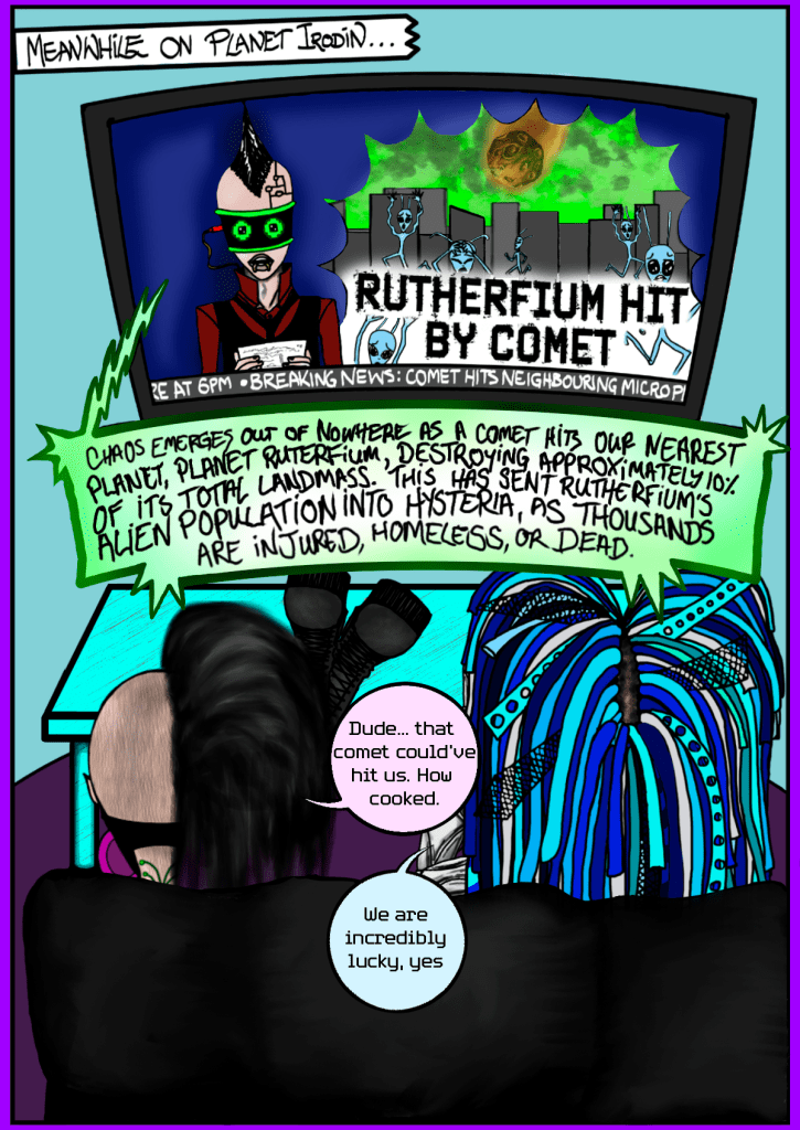
Sadly, when submission time came around, the final product was not 100% complete. These are the fully complete pages

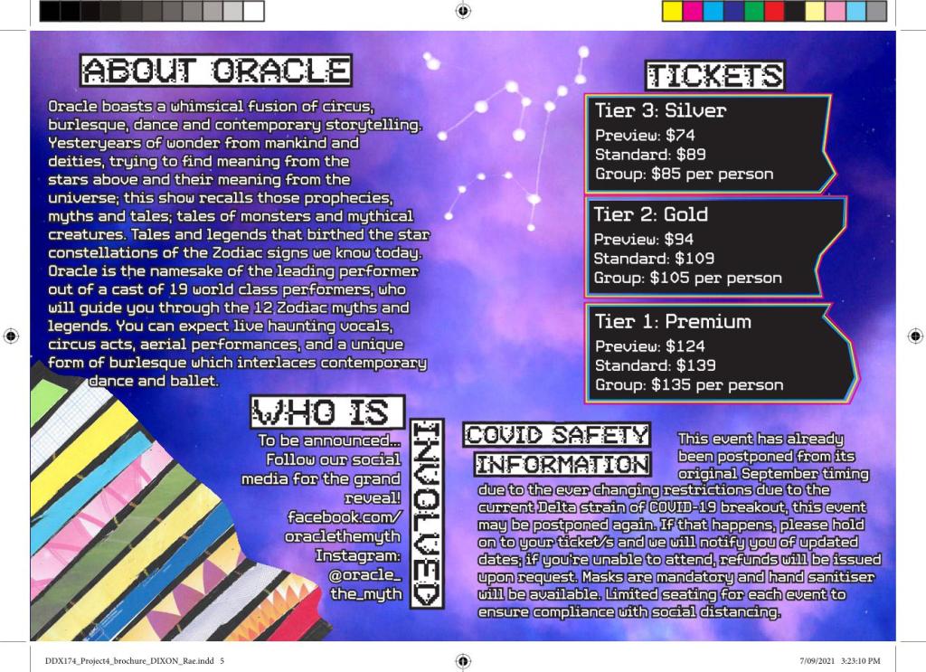
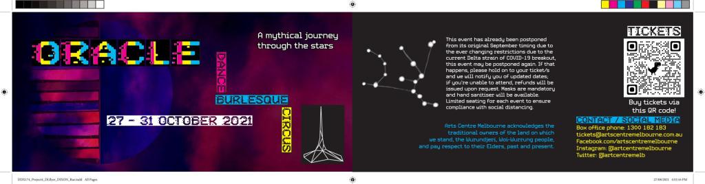
Trimester 2 – DDX174
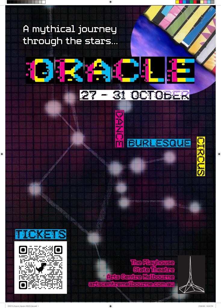
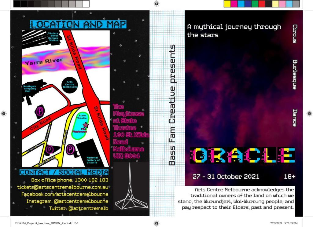
text
text
Trimester 3 – CIM151
I was also enrolled in DDX173, however the work I did in that unit was sub-par and is not worth sharing. As CIM151 was mostly a theory-based unit, I am only showing some illustrations done for a presentation here.
This trimester was especially hard due to a variety of grief-inducing external factors. The fact I managed to pass both units is a testament to the level of determination I have when I’m passionate about something – and that is how I realised I was in the right course doing the right pathway.
