As I’m editing more “From the Archive” posts, I have decided to create some briefs for imaginary clients and situations as a means to practice and hone in on the skills I’ve learnt over the years and to not drive myself insane with the amount of reflective writing I’ve been doing. Making this folio has made me recognise that much of my work doesn’t have mainstream appeal, so the first of my phony briefs will be something more acceptable for different industries than what I had been focused on. One area I have been interested in but have never made designs for is the medical industry – so it makes sense for this to be the precedent of the first phony briefs I do.
The brief
As someone who was trained in pathology collection, it is a no-brainer that the first medical industry brief I make will be on this subject.
Click here to show the brief
Valorous Veins is an upcoming pathology collection company with the core aim to alleviate the stress and anxiety in people with phobias and aversions that individuals may have concerning having their blood taken. Their goal is to encourage their clients to have their blood taken when medically required, with resources and advice to assist patients in overcoming their fears. They are aiming to create a calming environment that alleviates stress in their clinic opening in mid-2025.
As an upcoming business, they’re on a minimal budget. They require a brand identity that reflects their aims and ethos which can be applied to both digital and print collateral – signage, infographics, work attire, advertising, and social media posts being outlined as their priorities for getting the company up and running.
The goal of the designer will be to create branding for Valorous Veins that is clean, inviting, and reflects the compassion of those working at the company. The logo needs to be easily legible to welcome people of varying ages, especially elderly patients who may struggle with the legibility of reading certain typefaces. They will display the branding in a variety of mockups to show how the logo will look in different circumstances. The logo will be created as a vector to allow for scaling both large and small spaces.
The designer has also been asked to create infographics for the company about what’s involved in pathology collection, and the importance of phlebotomy in diagnosing conditions and monitoring essential components of the human body for it to function on a daily basis. The designer has free reign on how many they create, but the aim is a minimum of 3 infographics. They must be designed to be printed on A4 paper.
Inspiration
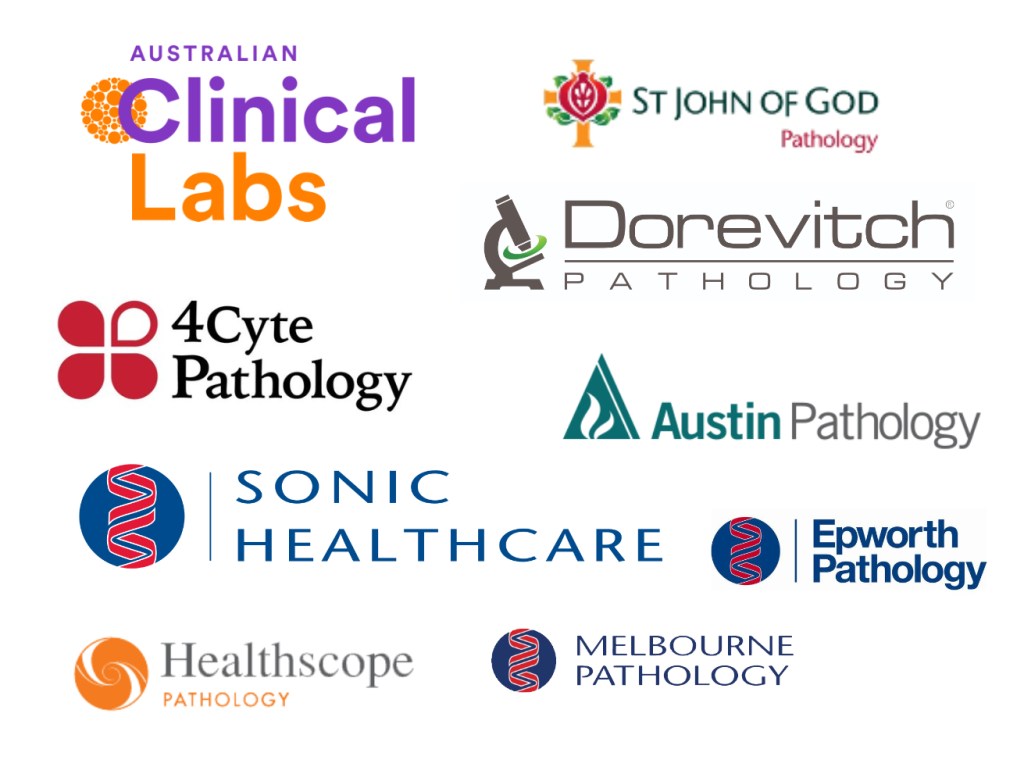
It’s important to see how other related companies brand themselves; seeing what works and what can be applicable to Valorous Veins will be the starting point for this brief. I will be looking at not just pathology branding, but medical centre branding to hone in on reoccurring aesthetic choices.

Note: Epworth and Melbourne Pathology are a part of Sonic Healthcare. All their divisions are variations of the same logo.
All of these logos have an icon to the left, and most of the type is in left alignment. The colours are an interesting aspect – only 4Cyte uses black or white, each other logo purely uses colour, with red, orange, blue, and green being the most prominent.
I often do black and white logos, so it will be interesting utilising colour for me.
Logo iterations
Referring back to the brief:
– The logo needs to be easily legible to welcome people of varying ages, especially elderly patients who may struggle with the legibility of reading certain typefaces
– The logo will be created as a vector to allow for scaling both large and small spaces
– “clean, inviting, and reflects the compassion of those working at the company”
With all this in mind, here are my iterations for Valorous Veins.
Logo refinement
Lorem ipsum
Infographic iterations
Lorem ipsum
Infographic refinement
Lorem ipsum
Final outcome
Lorem ipsum
